Became Hot Network Question
added 81 characters in body
Source Link
lazarea
  • 299
  • 1
  • 15

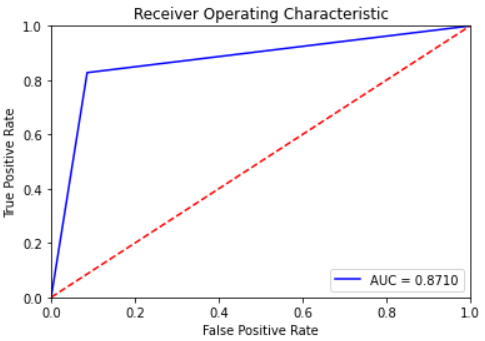
I am working on a binary classification and the plotted ROC curves that I am using for evaluation together with AUC, have seemed strange to me. Here is an example.

enter image description here

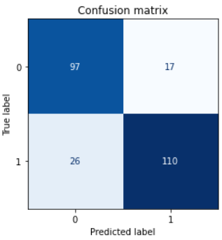
I understand that ROC is a visual representation of the true positive rate versus the false positive rate. When plotting the confusion matrix I can see there are significant number of false negatives and false positives alike:

enter image description here

I fail to understand how it is possible that the ROC curve only has a single break point. My question therefore is: What is the reason for ROC having such a shape instead of the typical smooth(er) monotonically increasing shape?

I tried playing around with the n_iter argument of RandomizedSearchCV, with the n_splits of StratifiedKFold and with the classifier estimator used (LogisticRegression(), RandomForestClassifier()).

Full reproducible code:

from sklearn.datasets import make_classification
from sklearn.linear_model import LogisticRegression
from sklearn.ensemble import RandomForestClassifier 
from sklearn.model_selection import train_test_split, StratifiedKFold, RandomizedSearchCV
from sklearn.metrics import ConfusionMatrixDisplay, confusion_matrix, roc_curve

random_seed = 12345
X, y = make_classification(n_samples=1000, n_features=5, n_classes=2)
X_train, X_test, y_train, y_test = train_test_split(X, y, random_state=random_seed)
cv = StratifiedKFold(n_splits=10, shuffle=True, random_state=random_seed)

search_output = RandomizedSearchCV(
    estimator = RandomForestClassifier(max_depth=10), 
    param_distributions = {'n_estimators': np.arange(100, 501, 50)},
    n_iter = 3, 
    scoring = 'roc_auc', 
    n_jobs = -1,
    cv = cv, 
    refit = True, 
    verbose = 1, 
    return_train_score = True, 
    random_state = random_seed  
).fit(X_train, y_train)

best_model = search_output.best_estimator_

y_preds = best_model.predict(X_test)

fpr, tpr, threshold = metrics.roc_curve(y_test, y_preds)
roc_auc = metrics.auc(fpr, tpr)
print(f"ROC-AUC: {roc_auc}.")
plt.title('Receiver Operating Characteristic')
plt.plot(fpr, tpr, 'b', label = f'AUC = {roc_auc:.4f}')
plt.legend(loc = 'lower right')
plt.plot([0, 1], [0, 1],'r--')
plt.xlim([0, 1])
plt.ylim([0, 1])
plt.ylabel('True Positive Rate')
plt.xlabel('False Positive Rate')
plt.show()

cm = confusion_matrix(y_test, y_preds, normalize=None)
fig, ax = plt.subplots(figsize=(4, 4))

disp = ConfusionMatrixDisplay(confusion_matrix=cm)
disp.plot(cmap="Blues", values_format=".0f", ax=ax, colorbar=False)

plt.title("Confusion matrix")
plt.show()

I am working on a binary classification and the plotted ROC curves that I am using for evaluation together with AUC, have seemed strange to me. Here is an example.

enter image description here

I understand that ROC is a visual representation of the true positive rate versus the false positive rate. When plotting the confusion matrix I can see there are significant number of false negatives and false positives alike:

enter image description here

I fail to understand how it is possible that the ROC curve only has a single break point. My question therefore is: What is the reason for ROC having such a shape instead of the typical smooth(er) monotonically increasing shape?

I tried playing around with the n_iter argument of RandomizedSearchCV, with the n_splits of StratifiedKFold and with the classifier estimator used (LogisticRegression(), RandomForestClassifier()).

Full reproducible code:

from sklearn.datasets import make_classification
from sklearn.linear_model import LogisticRegression
from sklearn.ensemble import RandomForestClassifier 
from sklearn.model_selection import train_test_split, StratifiedKFold, RandomizedSearchCV

random_seed = 12345
X, y = make_classification(n_samples=1000, n_features=5, n_classes=2)
X_train, X_test, y_train, y_test = train_test_split(X, y, random_state=random_seed)
cv = StratifiedKFold(n_splits=10, shuffle=True, random_state=random_seed)

search_output = RandomizedSearchCV(
    estimator = RandomForestClassifier(max_depth=10), 
    param_distributions = {'n_estimators': np.arange(100, 501, 50)},
    n_iter = 3, 
    scoring = 'roc_auc', 
    n_jobs = -1,
    cv = cv, 
    refit = True, 
    verbose = 1, 
    return_train_score = True, 
    random_state = random_seed  
).fit(X_train, y_train)

best_model = search_output.best_estimator_

y_preds = best_model.predict(X_test)

fpr, tpr, threshold = metrics.roc_curve(y_test, y_preds)
roc_auc = metrics.auc(fpr, tpr)
print(f"ROC-AUC: {roc_auc}.")
plt.title('Receiver Operating Characteristic')
plt.plot(fpr, tpr, 'b', label = f'AUC = {roc_auc:.4f}')
plt.legend(loc = 'lower right')
plt.plot([0, 1], [0, 1],'r--')
plt.xlim([0, 1])
plt.ylim([0, 1])
plt.ylabel('True Positive Rate')
plt.xlabel('False Positive Rate')
plt.show()

cm = confusion_matrix(y_test, y_preds, normalize=None)
fig, ax = plt.subplots(figsize=(4, 4))

disp = ConfusionMatrixDisplay(confusion_matrix=cm)
disp.plot(cmap="Blues", values_format=".0f", ax=ax, colorbar=False)

plt.title("Confusion matrix")
plt.show()
I am working on a binary classification and the plotted ROC curves that I am using for evaluation together with AUC, have seemed strange to me. Here is an example.

enter image description here

I understand that ROC is a visual representation of the true positive rate versus the false positive rate. When plotting the confusion matrix I can see there are significant number of false negatives and false positives alike:

enter image description here

I fail to understand how it is possible that the ROC curve only has a single break point. My question therefore is: What is the reason for ROC having such a shape instead of the typical smooth(er) monotonically increasing shape?

I tried playing around with the n_iter argument of RandomizedSearchCV, with the n_splits of StratifiedKFold and with the classifier estimator used (LogisticRegression(), RandomForestClassifier()).

Full reproducible code:

from sklearn.datasets import make_classification
from sklearn.linear_model import LogisticRegression
from sklearn.ensemble import RandomForestClassifier 
from sklearn.model_selection import train_test_split, StratifiedKFold, RandomizedSearchCV
from sklearn.metrics import ConfusionMatrixDisplay, confusion_matrix, roc_curve

random_seed = 12345
X, y = make_classification(n_samples=1000, n_features=5, n_classes=2)
X_train, X_test, y_train, y_test = train_test_split(X, y, random_state=random_seed)
cv = StratifiedKFold(n_splits=10, shuffle=True, random_state=random_seed)

search_output = RandomizedSearchCV(
    estimator = RandomForestClassifier(max_depth=10), 
    param_distributions = {'n_estimators': np.arange(100, 501, 50)},
    n_iter = 3, 
    scoring = 'roc_auc', 
    n_jobs = -1,
    cv = cv, 
    refit = True, 
    verbose = 1, 
    return_train_score = True, 
    random_state = random_seed  
).fit(X_train, y_train)

best_model = search_output.best_estimator_

y_preds = best_model.predict(X_test)

fpr, tpr, threshold = metrics.roc_curve(y_test, y_preds)
roc_auc = metrics.auc(fpr, tpr)
print(f"ROC-AUC: {roc_auc}.")
plt.title('Receiver Operating Characteristic')
plt.plot(fpr, tpr, 'b', label = f'AUC = {roc_auc:.4f}')
plt.legend(loc = 'lower right')
plt.plot([0, 1], [0, 1],'r--')
plt.xlim([0, 1])
plt.ylim([0, 1])
plt.ylabel('True Positive Rate')
plt.xlabel('False Positive Rate')
plt.show()

cm = confusion_matrix(y_test, y_preds, normalize=None)
fig, ax = plt.subplots(figsize=(4, 4))

disp = ConfusionMatrixDisplay(confusion_matrix=cm)
disp.plot(cmap="Blues", values_format=".0f", ax=ax, colorbar=False)

plt.title("Confusion matrix")
plt.show()
Source Link
lazarea
  • 299
  • 1
  • 15

Uncertainty about shape of ROC curve

I am working on a binary classification and the plotted ROC curves that I am using for evaluation together with AUC, have seemed strange to me. Here is an example.

enter image description here

I understand that ROC is a visual representation of the true positive rate versus the false positive rate. When plotting the confusion matrix I can see there are significant number of false negatives and false positives alike:

enter image description here

I fail to understand how it is possible that the ROC curve only has a single break point. My question therefore is: What is the reason for ROC having such a shape instead of the typical smooth(er) monotonically increasing shape?

I tried playing around with the n_iter argument of RandomizedSearchCV, with the n_splits of StratifiedKFold and with the classifier estimator used (LogisticRegression(), RandomForestClassifier()).

Full reproducible code:

from sklearn.datasets import make_classification
from sklearn.linear_model import LogisticRegression
from sklearn.ensemble import RandomForestClassifier 
from sklearn.model_selection import train_test_split, StratifiedKFold, RandomizedSearchCV

random_seed = 12345
X, y = make_classification(n_samples=1000, n_features=5, n_classes=2)
X_train, X_test, y_train, y_test = train_test_split(X, y, random_state=random_seed)
cv = StratifiedKFold(n_splits=10, shuffle=True, random_state=random_seed)

search_output = RandomizedSearchCV(
    estimator = RandomForestClassifier(max_depth=10), 
    param_distributions = {'n_estimators': np.arange(100, 501, 50)},
    n_iter = 3, 
    scoring = 'roc_auc', 
    n_jobs = -1,
    cv = cv, 
    refit = True, 
    verbose = 1, 
    return_train_score = True, 
    random_state = random_seed  
).fit(X_train, y_train)

best_model = search_output.best_estimator_

y_preds = best_model.predict(X_test)

fpr, tpr, threshold = metrics.roc_curve(y_test, y_preds)
roc_auc = metrics.auc(fpr, tpr)
print(f"ROC-AUC: {roc_auc}.")
plt.title('Receiver Operating Characteristic')
plt.plot(fpr, tpr, 'b', label = f'AUC = {roc_auc:.4f}')
plt.legend(loc = 'lower right')
plt.plot([0, 1], [0, 1],'r--')
plt.xlim([0, 1])
plt.ylim([0, 1])
plt.ylabel('True Positive Rate')
plt.xlabel('False Positive Rate')
plt.show()

cm = confusion_matrix(y_test, y_preds, normalize=None)
fig, ax = plt.subplots(figsize=(4, 4))

disp = ConfusionMatrixDisplay(confusion_matrix=cm)
disp.plot(cmap="Blues", values_format=".0f", ax=ax, colorbar=False)

plt.title("Confusion matrix")
plt.show()