added 25 characters in body
Source Link
Aditya
  • 2.5k
  • 2
  • 17
  • 35

One approach is to plot the data as a scatter plot with a low alpha, so you can see the individual points as well as a rough measure of density.

from sklearn.datasets import load_iris
iris = load_iris()
features = iris.data.T

plt.scatter(features[0], features[1], alpha=0.2,
            s=100*features[3], c=iris.target, cmap='viridis')
plt.xlabel(iris.feature_names[0])
plt.ylabel(iris.feature_names[1]);

sample image

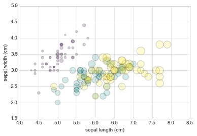
We can see that this scatter plot has given us the ability to simultaneously explore four different dimensions of the data:

  • the (x, y) location of each point corresponds to the sepal length and width,
  • the size of the point is related to the petal width, and
  • the color is related to the particular species of flower, i.e the Target Variable...

Multicolor and multifeature scatter plots like this can be useful for both exploration and presentation of data.

One approach is to plot the data as a scatter plot with a low alpha, so you can see the individual points as well as a rough measure of density.

from sklearn.datasets import load_iris
iris = load_iris()
features = iris.data.T

plt.scatter(features[0], features[1], alpha=0.2,
            s=100*features[3], c=iris.target, cmap='viridis')
plt.xlabel(iris.feature_names[0])
plt.ylabel(iris.feature_names[1]);

sample image

We can see that this scatter plot has given us the ability to simultaneously explore four different dimensions of the data:

  • the (x, y) location of each point corresponds to the sepal length and width,
  • the size of the point is related to the petal width, and
  • the color is related to the particular species of flower.

Multicolor and multifeature scatter plots like this can be useful for both exploration and presentation of data.

One approach is to plot the data as a scatter plot with a low alpha, so you can see the individual points as well as a rough measure of density.

from sklearn.datasets import load_iris
iris = load_iris()
features = iris.data.T

plt.scatter(features[0], features[1], alpha=0.2,
            s=100*features[3], c=iris.target, cmap='viridis')
plt.xlabel(iris.feature_names[0])
plt.ylabel(iris.feature_names[1]);

sample image

We can see that this scatter plot has given us the ability to simultaneously explore four different dimensions of the data:

  • the (x, y) location of each point corresponds to the sepal length and width,
  • the size of the point is related to the petal width, and
  • the color is related to the particular species of flower, i.e the Target Variable...

Multicolor and multifeature scatter plots like this can be useful for both exploration and presentation of data.

Source Link
Aditya
  • 2.5k
  • 2
  • 17
  • 35

One approach is to plot the data as a scatter plot with a low alpha, so you can see the individual points as well as a rough measure of density.

from sklearn.datasets import load_iris
iris = load_iris()
features = iris.data.T

plt.scatter(features[0], features[1], alpha=0.2,
            s=100*features[3], c=iris.target, cmap='viridis')
plt.xlabel(iris.feature_names[0])
plt.ylabel(iris.feature_names[1]);

sample image

We can see that this scatter plot has given us the ability to simultaneously explore four different dimensions of the data:

  • the (x, y) location of each point corresponds to the sepal length and width,
  • the size of the point is related to the petal width, and
  • the color is related to the particular species of flower.

Multicolor and multifeature scatter plots like this can be useful for both exploration and presentation of data.