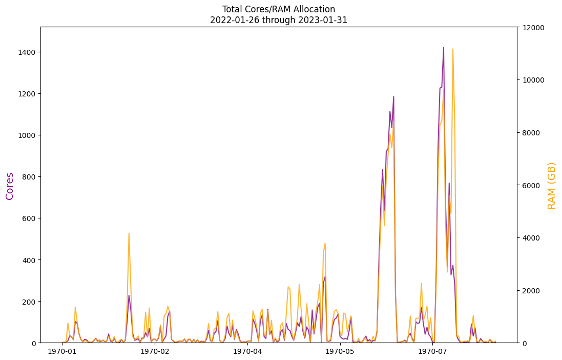
I'm attempting to port some old reports from Pandas to Polars. I am happy with the data, and am now attempting to plot a few time series. This is working, but I'm finding that matplotlib just doesn't seem to want to cooperate with Polars' pl.Datetime types.
When initially populating the dataframe, I am doing this to parse the timestamps:
# using floats so we don't quantize when doing mean() aggregations later
df = df.with_columns(
    [
        pl.col("AllocCPUS").cast(pl.Float64),
        pl.col("AllocNodes").cast(pl.Float64),
        pl.col("Start").str.strptime(pl.Datetime, fmt="%FT%T"),
        pl.col("End").str.strptime(pl.Datetime, fmt="%FT%T"),
    ]
)
This seems to work correctly. Skipping forward over a bunch of (what should be irrelevant) logic, we come to trying to generate a plot. Here's what one of the dataframes looks like just before calling matplotlib:
shape: (5, 2)
┌─────────────────────┬───────────┐
│ Start               ┆ AllocCPUS │
│ ---                 ┆ ---       │
│ datetime[μs]        ┆ f64       │
╞═════════════════════╪═══════════╡
│ 2022-01-26 00:00:00 ┆ 1.0       │
│ 2022-01-29 00:00:00 ┆ 1.0       │
│ 2022-01-31 00:00:00 ┆ 4.0       │
│ 2022-02-01 00:00:00 ┆ 9.0       │
│ 2022-02-02 00:00:00 ┆ 34.0      │
└─────────────────────┴───────────┘
I attempt to plot this, like so:
## relevant imports from earlier in the project
#
#import polars as pl
#import matplotlib
#import matplotlib.pyplot as plt
#%matplotlib inline

fig = plt.figure(figsize=(12,8), facecolor='white')
ax_cpu = fig.add_subplot(111)
ax_ram = ax_cpu.twinx()

ax_cpu.set_ylim(ymax=cores_max)
ax_ram.set_ylim(ymax=memory_max)

ax_cpu.set_ylabel('Cores', fontsize=14, color='purple')
ax_ram.set_ylabel('RAM (GB)', fontsize=14, color='orange')

ax_cpu.plot(binned_df_cpu_all, color='purple', alpha=0.8)
ax_ram.plot(binned_df_ram_all, color='orange', alpha=0.8)

ax_cpu.xaxis.set_major_formatter(matplotlib.dates.DateFormatter('%Y-%m'))
ax_ram.xaxis.set_major_formatter(matplotlib.dates.DateFormatter('%Y-%m'))

plt.title('Total Cores/RAM Allocation\n{start} through {end}'.format(
    start=datestamp_min.date(), end=datestamp_max.date()))
This prints the graph as I expect to see, with a correct title (note: dates look correct there!), Y axis ranges, etc. However, across the X axis the dates are formatted "1970-01" and so on. If I drop the two set_major_formatter() calls, the dates are simply integers starting from 0, one per day.
I've been trying to find an explanation or workaround, but unfortunately all of my searching is only turning up people asking how to initially parse strings into dates in Polars - something I'm past, here. Alternatively, I can occasionally find vague references to a problem with matplotlib and pandas where they had differences between epochs, however I am not using pandas here. Additionally, even if I cast the dtype to a python datetime.datetime, or even cast the whole polars dataframe to either a pandas dataframe or a numpy 2d array, the behavior does not change (which I thought would rule out an interoperability issue).
I'm at a complete loss as to what is going wrong. I can't imagine I'm running into a bug, here, and I must be doing something wrong? Just in case, however, I want to note that I a have polars==0.16.7 and matplotlib==3.7.0. I am running this within JupyterLab at this time.

