14
$\begingroup$

I have recently published a dataset (link) with 369 classes. I ran a couple of experiments on them to get a feeling for how difficult the classification task is. Usually, I like it if there are confusion matrices to see the type of error being made. However, a $369 \times 369$ matrix is not practical.

Is there a way to give the important information of big confusion matrices? For example, usually there are a lot of 0s which are not so interesting. Is it possible to sort the classes so that most non-zero entries are around the diagonal in order to allow showing multiple matrices which are part of the complete confusion matrix?

Here is an example for a big confusion matrix.

Examples in the Wild

Figure 6 of EMNIST looks nice:

enter image description here

It is easy to see where many cases are. However, those are only $26$ classes. If the whole page was used instead of only one column this could probably be 3x as many, but that would still only be $3 \cdot 26 = 78$ classes. Not even close to 369 classes of HASY or 1000 of ImageNet.

See also

My similar question on CS.stackexchange

$\endgroup$
6
  • $\begingroup$ I pity you ;-) You can try the confusion matrices of one vs. all for each of the classes. Given them, look or classes in which the behavior is not typical and use a full confusion matrix just on them. $\endgroup$
    – DaL
    Commented Feb 21, 2017 at 10:02
  • 1
    $\begingroup$ Why not just report the accuracy of the model for each category. Who really needs to see the entire matrix? $\endgroup$ Commented Feb 21, 2017 at 11:04
  • 1
    $\begingroup$ @DarrinThomas It's not only about reporting it in a paper. It is also about analyzing errors myself. $\endgroup$ Commented Feb 21, 2017 at 11:05
  • 1
    $\begingroup$ Firstly you could normalize the values row-wise and then plot it as a heatmap. Further, you could sort the class by the classwise accuracy (normalized value on the diagonal). I suppose this would greatly increase readability. $\endgroup$ Commented Feb 21, 2017 at 16:07
  • 1
    $\begingroup$ I should probably ask this in math.SE / stackoverflow again. I'm pretty sure there are algorithms which re-order the rows / columns in such a way that most of the value is close to the diagonal. $\endgroup$ Commented Feb 21, 2017 at 17:59

3 Answers 3

8
$\begingroup$

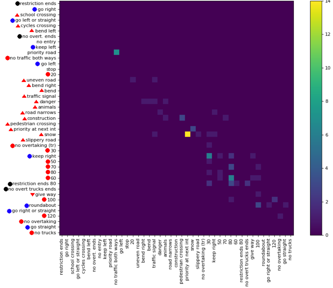
You can apply a technique I described in my masters thesis (page 48ff) and called Confusion Matrix Ordering (CMO):

  1. Order the columns/rows in such a way, that most errors are along the diagonal.
  2. Split the confusion matrix into multiple blocks such that the single blocks can easily printed / viewed - and such that you can remove some of the blocks because there are to few data points.

Nice side effect: This method also automatically clusters similar classes together. Figure 5.12 of my masters thesis shows that:

enter image description here

You can apply confusion matrix ordering with clana

$\endgroup$
1
  • $\begingroup$ Thx for sharing this. When I run: clana get-cm --gt gt-train.csv --predictions train-pred.csv --n 10, it gives an error: Error: No such option: --gt. $\endgroup$
    – arun
    Commented Aug 16, 2022 at 22:01
2
$\begingroup$

Instead of trying to re-order the columns and rows, I would suggest trying to find some other way to visualize the data.

Here's one possible alternative suggestion. You could cluster the classes, say into ~ 20 clusters, where each cluster has ~ 20 classes in it, using some kind of clustering algorithm that puts similar classes together into the same cluster (e.g., if two classes are frequently confused with each other, they should be more likely to be in the same cluster). Then you can show a coarse-grained confusion matrix, with one row/column per cluster; the cell at $(i,j)$ shows how often an instance of some class in cluster $i$ is predicted to have some class in cluster $j$. Also, you can have ~ 20 fine-grained confusion matrices: for each cluster, you can show the confusion matrix of classes, for the ~ 20 classes in each cluster. Of course, you could also extend this by using hierarchical clustering and have confusion matrices at multiple granularities.

There may be other possible visualization strategies as well.

As a general philosophical point: it might also help to clarify your goals (what you want to get out of the visualization). You can distinguish two kinds of uses of visualization:

  • Exploratory analysis: You're not sure what you're looking for; you just want a visualization that might help you look for interesting patterns or artifacts in the data.

  • Figures with a message: You have a particular message you want the reader to take away, and you want to devise a visualization that helps support that message or provide evidence for the message.

It might help you to know which you're trying to aim for, and then devise a visualization aimed at that:

  • If you're doing exploratory analysis, rather than trying to pick one perfect visualization, it's often helpful to try creating as many visualizations as you can think of. Don't worry about whether any of them are perfect; it's OK if each one is flawed, as each might give you a potentially different perspective on the data (it will probably be good in some ways and bad in others).

  • If you have a particular message you're trying to convey or a theme you're trying to develop, look for a visualization that supports that theme. It's hard to make a specific suggestion without knowing what that theme/message might be.

$\endgroup$
0
$\begingroup$

Its important to know why the EMNIST confusion matrix looks good.

But I find it weird that they haven't maintained the colouring with higher numbers being darkest, for example most of the empty miss-classifications containing zeros are of a darker grey than those that contain an integer. Doesn't seem consistent.

I'd try using the EMINST style except keep it consistent where colour indicates the number of entries in a cell. White for zero entires, and black for the most entries.

A perfect classification would be a black diagonal with completely white upper and lower triangles. Where there was any grey patches in the triangles would indicate problems. Even on a 1000 class set this would be helpful. For ImageNet where the classes are hierarchical, perhaps sorting the columns so that subclasses are grouped the right of the parent class would lead to squareish dark patches.

Also if you are getting the top 5 responses for an image, classes may not be mutually exclusive, such that dog classification for an image of a lap_dog should still be true, hence in such a confusion matrix, the more general classes should be much darker than the precise classifications (if the colours are normalised.) Hence the top left square would be darkest.

$\endgroup$

Your Answer

By clicking “Post Your Answer”, you agree to our terms of service and acknowledge you have read our privacy policy.

Not the answer you're looking for? Browse other questions tagged or ask your own question.