0
$\begingroup$

I have a dataset with features that most of them are nominal categorical features, I have converted my model to indicator values,

Original

F1,F2,L
1 ,1 ,50
2 ,3 ,30

After indicator values

F1-1,F1-2,F2-1,F2-3,L
1   ,0   ,1   ,0   ,50
0   ,1   ,0   ,1   ,30

I used different regression algorithm (Poisson, Bayesian, Decision Tree reg, Decision Forest reg, Boosted decision tree reg, linear regression, neural network), but all of then have low performance (r2 ~ 20-30)

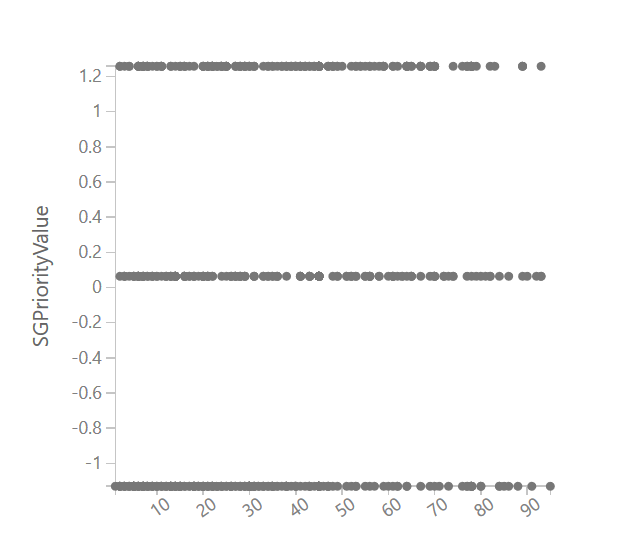
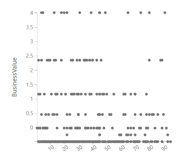
Then I was thinking how regression can find values, then I found something interesting : relation of data with label They are like below picture

regression categorical features regression nominal data

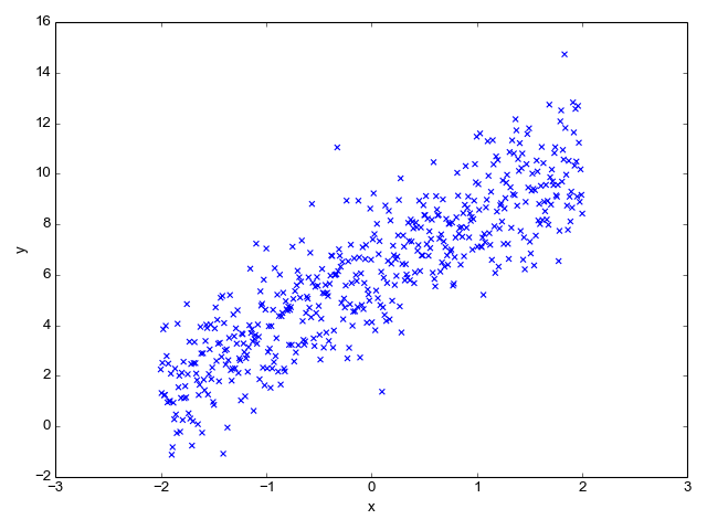
But in most of the books and examples and samples suitable data for regression are like below

regression

And this is the point I got confused!

So my question is how regression (or which algorithms) are suitable for predicting values in high categorical data

$\endgroup$

2 Answers 2

1
$\begingroup$

TL;DR: It is a convention to convert categorical features to numeric features before you can use them in regression, or any other machine learning algorithm for that matter. Technically, there is nothing that is stopping ML algorithms from working with categorical features but their software implementation would be prohibitively expensive, hence this convention in ML practice.

Turning to your problem, if you are trying to convert categorical label values into numerical values, there are various methods but it appears the best one for your data would be One-Hot encoder. Both Scikit-Learn and PySpark, and most other libraries provide handy functions for it, as it is very common operation. For example:

from sklearn.preprocessing import OneHotEncoder
one_hot = OneHotEncoder()
one_hot.fit(...your_columns...)

Once you have all data in numeric form, you can use pretty much any algorithm.

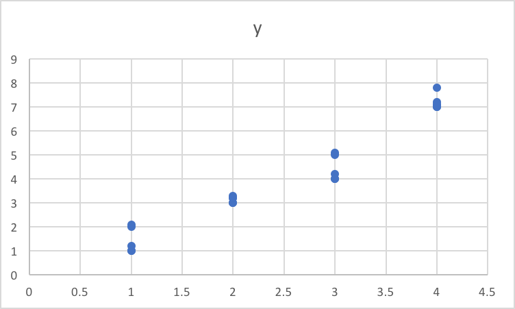
As for the last figure, it is scatter plot between x and y, and it is not obvious what x and y are. Weirdly enough, it is not one-on-one relationship because a given value of x seems to produce multiple value of y?!!! And I am not sure what you are plotting in earlier figures that is giving you straight lines!

$\endgroup$
1
  • $\begingroup$ thanks for answer, yes I already used one-hot encoder, (see my second dataset, in azure it's called indicator values) then if I compare the label with one of the features, since all have 0 or 1 value there will be a graph which has many 0s and many 1s, and it look like my second image and it look likes the straight lines , (or may be I should have switched x and y axis, btw in that situation still there was some straight lines) this is why I got confused, because it seems I can't find a line to estimate values based on that $\endgroup$
    – Reza
    Commented Dec 31, 2017 at 16:37
0
$\begingroup$

The relation that your graph is showing for you categorical variable versus the numerical label does not look to be very strong as for every value of SGPriorityValue, you have all sorts of values of y it seems. For a categorical variable the relationship might not look as smooth and continuous (Like the last graph you have) but there has to be pattern for any model to fit.

usually if a categorical variable is related to a numerical value, you can expect a graph like below.

enter image description here

$\endgroup$
5
  • $\begingroup$ Thanks for answer, SGPriority has 3 values 'Critical,Important,Trivial,' so I convert it to 3 numbers 7,5,3 and the I used normalization which generates these 3 new numbers, the question is either with normalization or without or just one-hot encoding categories if I draw a scatter plotter between the feature and lablel it will be something like that, because there will be always 2 (or multiple) concrete values, I don't know hot could it get to something that you drew $\endgroup$
    – Reza
    Commented Dec 31, 2017 at 16:41
  • $\begingroup$ It won't, hot encode is just a representation of the data. So if your data itself does not have linear pattern with the value, no encoding will show a pattern, hence a bad R-square value. $\endgroup$
    – vc_dim
    Commented Jan 1, 2018 at 14:59
  • $\begingroup$ I don't get it, consider there is only one categorical feature with values A,B, if you do one-hot encoding the values for column-A will be 0 and 1 and same for column-B, now if you do a scatter based of label and column-A, it will be some straight lines, correct? $\endgroup$
    – Reza
    Commented Jan 1, 2018 at 16:40
  • $\begingroup$ Yes it will be a straight line. But the point is if it will have a slope. That slope will help you get a good regression. The Chart you have at the end has a nice slope. But if I try to do a similar trendline for Top two charts, I might not be getting a nice slope as data is scattered all over the place instead of showing a good pattern. Changing encoding will not help there. Let me know if you need more detail. I can edit my answers to include some examples. $\endgroup$
    – vc_dim
    Commented Jan 3, 2018 at 10:09
  • $\begingroup$ Yeah, thanks, actually the original issue is performance (r2) on my data is very low (0.20) so I am trying to find root cause and I tought categorical features could be root cause $\endgroup$
    – Reza
    Commented Jan 3, 2018 at 14:14

Your Answer

By clicking “Post Your Answer”, you agree to our terms of service and acknowledge you have read our privacy policy.

Not the answer you're looking for? Browse other questions tagged or ask your own question.