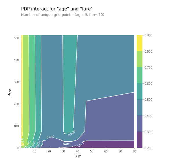
The plot below is an example from pdpbox library https://github.com/SauceCat/PDPbox/blob/master/tutorials/pdpbox_binary_classification.ipynb. The what does 0.900 color saturation to the right mean with respect to age and fare in the below plot? The data is taken from Titanic dataset and target variable is survived or not.

$\begingroup$
$\endgroup$
Add a comment
|
1 Answer
$\begingroup$
$\endgroup$
The partial dependence plot shows an increase in survival probability at ages between 0 and 10 with any fare range.
For more on how to interpret partial dependence plot:
