I have blood test results with 20 features from 170 patients, and trying to predict a categorical disease outcome. The input features are all continuous values except sex (0:male, 1:female) There are no missing values (used imputation for the few missing values)
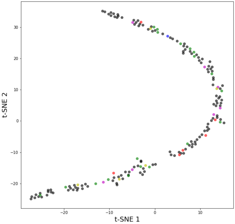
When I plotted a 2D t-SNE plot, the results is as the attached image.(Figure 1)
A single curved line shape.
I expected the plot to be more scattered, but even if I increase the perplexity value from 13 to 20 or 30 it still remains as a line shape.
(the initial value of 13 is from a recommendation that sqrt # of samples is a good starting point)
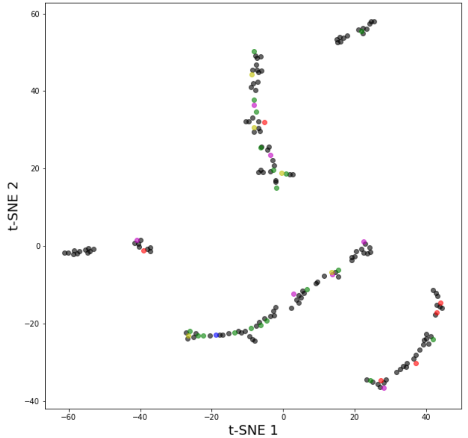
Reducing the perplexity value to 6 makes the datapoints form small chunks (Figure 2), and I am aware this is because small perplexity values make the datapoints conserve proximity with only a few neighbors so this results in small groups.
In a related question this curved line shape appeared in a time-series dataset. I undetstood that time-series data have datapoints that change in small increments across most of the features, so the t-SNE results form a line.
So this means in my dataset, patients that have similar values, the "direction" of similarity is not random due to human physiology. For instance if patient A & B are similar and B has a slightly higher RBC value, the WBC, hematocrit are also higher and BIL values are lower. Hence, each individual patient may look like data from a time-series dataset.
Does this explanation make sense? Or is could there be a different explanation of this line-shaped distribution of a t-SNE plot?


