0
$\begingroup$

I'm now working on an analysis comparing time consuming of a pairwise experiment. AI and human processed same subject in experimental group and processing time recorded. The time consuming of AI are significantly shorter than human and two variables(time of AI route and time of human route) have different distribution which makes it is weird to show them on a same graph.

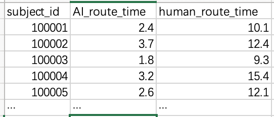
The head of record table is like this.

enter image description here

The graph visualization will be used in an essay focusing on showing the difference of their means and their ranges rather than the distributions. Because of that, the data should be presented objectively without transformation.

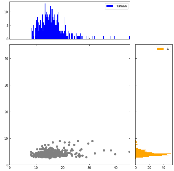
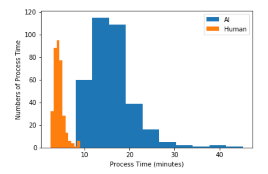
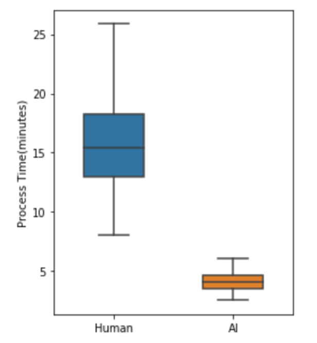
What below are my solutions and all of them seems ugly.

enter image description here enter image description here enter image description here

Is there any trick you guys using to visualize such data? Please teach me. Thank you

$\endgroup$
3
  • 1
    $\begingroup$ plot 1) I have no idea what those grey dots are. Plot 2) I think the keys are reversed, but I like that plot because you can see the distributions. Plot 3) Best plot in my opinion, because it is easier to extract properties of the distributions (though you don't visualize the distribution too much. $\endgroup$ Commented Mar 2, 2020 at 11:25
  • $\begingroup$ Two axes, left and right? Manually forced scaling? Generally the statement of the question is weird $\endgroup$
    – Mikhail M
    Commented Mar 2, 2020 at 14:48
  • $\begingroup$ I think you should just set the y scale in the first plot, maybe make it intereactive so you can explore the value. $\endgroup$ Commented Mar 2, 2020 at 23:04

1 Answer 1

1
$\begingroup$

The only problem is that you did not use colors in first plot. That can change the game a lot!

the other point is to re-think of the term "ugly" as all your plots look normal. Specially Histogram and BoxPlots. If you want the first scatter plot to be more well-spread, you need to scale your features. Try a standard scaler and see the results. I strongly recommend checking this to get a better feeling about scaling and plots.

The other points is the term "comparing". What do you want from the comparison? If it is correlation then the first plot is showing it to some extent (which can be validated by calculating Pearson correlation and its p-value). If you want to see the difference between classes then second and third are doing a great job! you can enrich them with a F-value and justify your results.

$\endgroup$

Your Answer

By clicking “Post Your Answer”, you agree to our terms of service and acknowledge you have read our privacy policy.

Not the answer you're looking for? Browse other questions tagged or ask your own question.