The airline passengers dataset is available here, but it also comes with in R.
I'm working with python, and I import the following (besides the usual like pandas and numpy.)
from statsmodels.tsa.stattools import pacf,acf
from statsmodels.graphics import tsaplots
from statsmodels.tsa.stattools import adfuller,kpss
from statsmodels.tsa.statespace.sarimax import SARIMAX
from scipy import stats
I'm applied the log, and then 1-period difference for detrending , and then 12-period for 'deseasonality'. Then I drop the nan, with df_log_dif_dif12.dropna(inplace=True).
I obtain the following numpy array:
array([[ 0.03916403],
       [ 0.00036069],
       [-0.02049559],
       [-0.01293918],
       [ 0.06614834],
       [ 0.03991464],
       [ 0.        ],
       [ 0.01135398],
       [-0.03871451],
       [-0.01941809],
       [ 0.07915025],
       [ 0.06084382],
       [-0.05744823],
       [ 0.05867027],
       [-0.04454824],
       [ 0.13070532],
       [-0.1413435 ],
       [-0.02033086],
       [ 0.        ],
       [-0.00516566],
       [ 0.04490648],
       [ 0.05016097],
       [-0.07706281],
       [-0.00541555],
       [ 0.01739174],
       [-0.10141492],
       [ 0.02384019],
       [-0.04275515],
       [ 0.14071984],
       [-0.05793703],
       [ 0.05085842],
       [-0.06823441],
       [ 0.0372786 ],
       [-0.00078924],
       [-0.00801748],
       [-0.01941927],
       [-0.05129329],
       [ 0.11598381],
       [ 0.05994687],
       [-0.03685263],
       [-0.11566947],
       [ 0.02930341],
       [-0.02100545],
       [ 0.00886155],
       [-0.02614118],
       [-0.05412233],
       [-0.01001563],
       [ 0.00455859],
       [-0.08167803],
       [ 0.03742641],
       [-0.03038921],
       [ 0.05623461],
       [ 0.06128855],
       [ 0.05159025],
       [-0.06010737],
       [ 0.01439738],
       [-0.00690405],
       [ 0.03838526],
       [ 0.01016797],
       [ 0.04040064],
       [ 0.04377876],
       [-0.08693335],
       [ 0.04209822],
       [-0.02666052],
       [ 0.03352269],
       [ 0.01010331],
       [-0.01757468],
       [ 0.01702296],
       [-0.00676902],
       [-0.02455194],
       [ 0.03904495],
       [-0.0338626 ],
       [ 0.01294254],
       [-0.00132594],
       [-0.0201613 ],
       [ 0.01213761],
       [ 0.00805373],
       [-0.04538943],
       [ 0.02826856],
       [-0.02544769],
       [-0.01865761],
       [ 0.02360168],
       [-0.03809469],
       [ 0.00763441],
       [-0.02050564],
       [ 0.0329362 ],
       [-0.01002967],
       [ 0.00406712],
       [ 0.01068311],
       [-0.0021597 ],
       [ 0.02385238],
       [-0.0131451 ],
       [-0.00355741],
       [-0.00754672],
       [-0.0246669 ],
       [-0.01715308],
       [-0.02143186],
       [-0.03822764],
       [-0.01671348],
       [ 0.02228504],
       [ 0.00805567],
       [ 0.02406601],
       [ 0.02382245],
       [-0.07822917],
       [ 0.03399761],
       [-0.01773709],
       [-0.01328875],
       [ 0.05418664],
       [ 0.01560094],
       [ 0.04194959],
       [ 0.01450278],
       [ 0.01664015],
       [-0.06421892],
       [ 0.0281982 ],
       [-0.00824012],
       [ 0.03472113],
       [-0.01082138],
       [ 0.02958112],
       [ 0.02873222],
       [-0.03682195],
       [-0.01308537],
       [-0.10237906],
       [ 0.12046607],
       [-0.03525956],
       [ 0.00856349],
       [ 0.00137704],
       [-0.04593429],
       [ 0.01202388],
       [ 0.03183046],
       [-0.05008233],
       [-0.00996401]])
Now, when I run
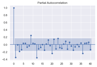
partial_acf_log=pacf(df_log_dif_dif12,nlags=df_log_dif_dif12.shape[0] // 2 - 1)
tsaplots.plot_pacf(partial_acf_log,lags=len(partial_acf_log)//2-1);
I get the following picture:
This picture is nothing like the one in the book by Shumway and Stoffer Time Series Analysis.
In my graph, I see no significant peaks, whereas in the graph from the book, we can see significant peaks for lags 1, and multiples of 12... The strangest thing was when I first ran the plot, it showed something much similar to the book. But, when I ran it for the second time, the plot changed completely. Not only that, I don't even get to have enough data to compute lags of size 35, 40... But in the book, the authors are able.
P.S.: Just for comparison here's a picture of the transformed, detrended and deseasonalised data in the book.
It's equal to the plot you get from the array above...


