1
$\begingroup$

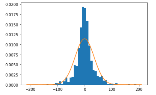
I'm tyring to compare a normal distribution to a histogram of actual data. I'm plotting the two with the following Python code:

 plt.hist(adjustedVar.iloc[:,8], bins=50, density=True)
 xmin, xmax = plt.xlim()
 x = np.linspace(xmin, xmax, 100)
 y = norm.pdf(x, meanAdj, stddevAdj)
 line = plt.plot(x, y)
 plt.show(line)

Its looking ok: enter image description here

Now what I want to do is annotate with a line showing where the 1-tail 99% statistical significance is on the right of the line plot.

Can anyone advise on how to do this on the same graph please? I've been trying the annotate function but not having luck. Need a pointer in the right direction.

$\endgroup$
2
  • $\begingroup$ What would you do if you were to annotate it by hand, either drawing on the graph using a program like Paint or pointing with a laser pointer during your presentation? This will clarify your confusion so we can point you toward a solution, since you seem to have a misconception about hypothesis testing. (Cutoffs based on t-stats don’t make sense in the original data, for example.) $\endgroup$
    – Dave
    Commented Nov 6, 2022 at 0:33
  • $\begingroup$ This is a great question, although you might get a faster response on Stack Overflow. $\endgroup$
    – Ethan
    Commented Nov 6, 2022 at 14:16

1 Answer 1

1
$\begingroup$

There are two steps:

  1. Calculate the 1-tail 99% statistical significance value
  2. Plot that value

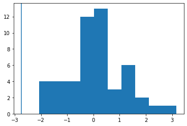
Something like this:

# Calculate value
from scipy import stats

data = stats.norm.rvs(size=50)
statistic, pvalue = stats.ttest_1samp(data, popmean=.5)

# Plot value
import matplotlib.pyplot as plt

plt.hist(data)
plt.axvline(x=statistic);

enter image description here

$\endgroup$

Your Answer

By clicking “Post Your Answer”, you agree to our terms of service and acknowledge you have read our privacy policy.

Not the answer you're looking for? Browse other questions tagged or ask your own question.