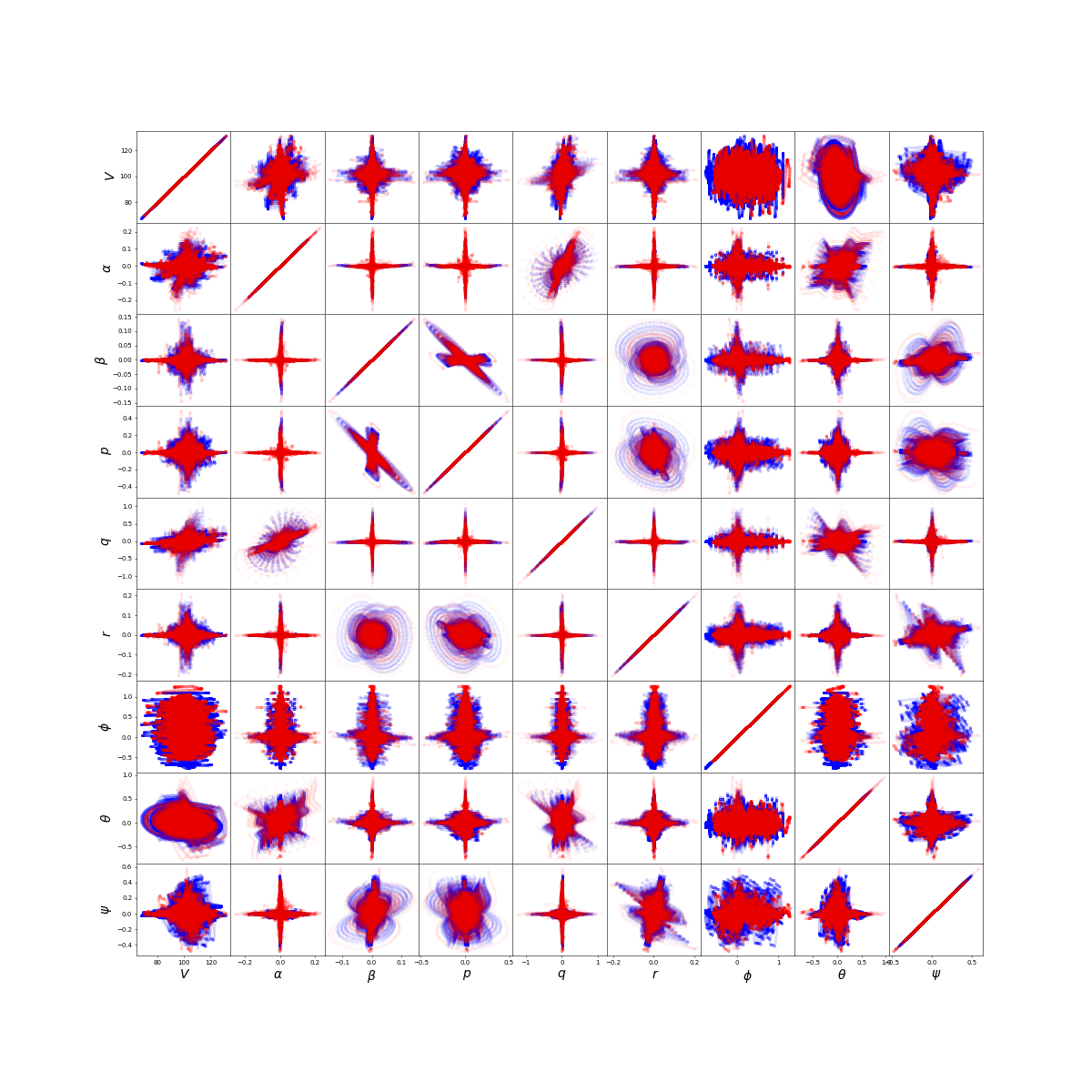
I have a trained GAN that generates synthetic flight data (9 state variables/features). I plotted the correlation for each pair of state variables similiar to Seaborn's pairplot(). But I have two sets of correlations for each pair: one set for the real data (the blue data in the plots), and the second set for the generated data (the red data in the plots). What is a good metric I can use to evaluate how well the red data is covering the blue data? The ideal case is that the red data cluster is perfectly covering the blue data. I have looked at JS and KL divergences, but they are for probability distributions, not data distributions. Both sets of data are 720000 by 9.

$\begingroup$
$\endgroup$
Add a comment
|
1 Answer
$\begingroup$
$\endgroup$
2
One option is calculating the percent of blue not covered by red. The lower the number, the better the GAN.
-
$\begingroup$ I like that idea. Implementing it would be difficult I think, since its just discrete data points in a plot. I might be able to use support vector machines to make a decision boundary around the data cluster... $\endgroup$ Commented Dec 8, 2022 at 0:40
-
$\begingroup$ Loop through each point twice. The first time with just blue data, count if a point is blue or no color. The second time with blue and red data, count if blue, red, or no color. It is a data analysis solution, not a machine learning solution. $\endgroup$ Commented Dec 8, 2022 at 15:42
