What you are looking to do is perform some projection or feature compression (both of those terms mean the same thing in this context) onto a 2D plane while maintaining relative similarity. Many of these techniques exist each optimizing a different aspect of relative "closeness".
The following code will show you 4 different algorithms which exist which can be used to plot high dimensional data in 2D. Although these algorithms are quite powerful you must remember that through any sort of projection a loss of information will result. Thus you will likely have to tune the parameters of these algorithms in order to best suit it for your data. In essence a good projection maintains relative distances between the in-groups and the out-groups.
The Boston dataset has 13 features and a continuous label $Y$ representing a housing price. We have 339 instances.
from sklearn.datasets import load_boston
from sklearn.linear_model import LinearRegression
from sklearn.model_selection import train_test_split
import matplotlib.pyplot as plt
%matplotlib inline
from sklearn.manifold import TSNE, SpectralEmbedding, Isomap, MDS


bostonboston  ==  load_bostonload_bo ()
X = boston.data
Y = boston.target

X_train, X_test, y_train, y_test = train_test_split(X, Y, test_size=0.33, shuffle= True)


# Embed the features into 2 features using TSNE# Embed
X_embedded_iso  = Isomap(n_components=2).fit_transform(X)
X_embedded_mds  = MDS(n_components=2, max_iter=100, n_init=1).fit_transform(X)
X_embedded_tsne = TSNE(n_components=2).fit_transform(X)
X_embedded_spec = SpectralEmbedding(n_components=2).fit_transform(X)

print('Description of the dataset: \n')

print('Input shape : ', X_train.shape)
print('Target shape: ', y_train.shape)

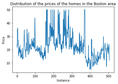
plt.plot(Y)
plt.title('Distribution of the prices of the homes in the Boston area')
plt.xlabel('Instance')
plt.ylabel('Price')
plt.show()

print('Embed the features into 2 features using Spectral Embedding: ', X_embedded_spec.shape)
print('Embed the features into 2 features using TSNE: ', X_embedded_tsne.shape)

fig = plt.figure(figsize=(12,5),facecolor='w')
plt.subplot(1, 2, 1)
plt.scatter(X_embedded_iso[:,0], X_embedded_iso[:,1], c = Y, cmap = 'hot')
plt.title('2D embedding using Isomap \n The color of the points is the price')
plt.xlabel('Feature 1')
plt.ylabel('Feature 2')
plt.colorbar()
plt.tight_layout()

plt.subplot(1, 2, 2)
plt.scatter(X_embedded_mds[:,0], X_embedded_mds[:,1], c = Y, cmap = 'hot')
plt.title('2D embedding using MDS \n The color of the points is the price')
plt.xlabel('Feature 1')
plt.ylabel('Feature 2')
plt.colorbar()
plt.show()
plt.tight_layout()

fig = plt.figure(figsize=(12,5),facecolor='w')
plt.subplot(1, 2, 1)
plt.scatter(X_embedded_spec[:,0], X_embedded_spec[:,1], c = Y, cmap = 'hot')
plt.title('2D embedding using Spectral Embedding \n The color of the points is the price')
plt.xlabel('Feature 1')
plt.ylabel('Feature 2')
plt.colorbar()
plt.tight_layout()

plt.subplot(1, 2, 2)
plt.scatter(X_embedded_tsne[:,0], X_embedded_tsne[:,1], c = Y, cmap = 'hot')
plt.title('2D embedding using TSNE \n The color of the points is the price')
plt.xlabel('Feature 1')
plt.ylabel('Feature 2')
plt.colorbar()
plt.show()
plt.tight_layout()
The target $Y$ looks like:

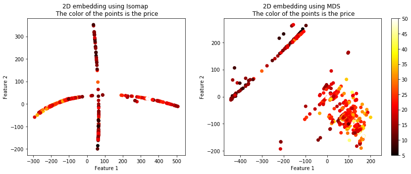
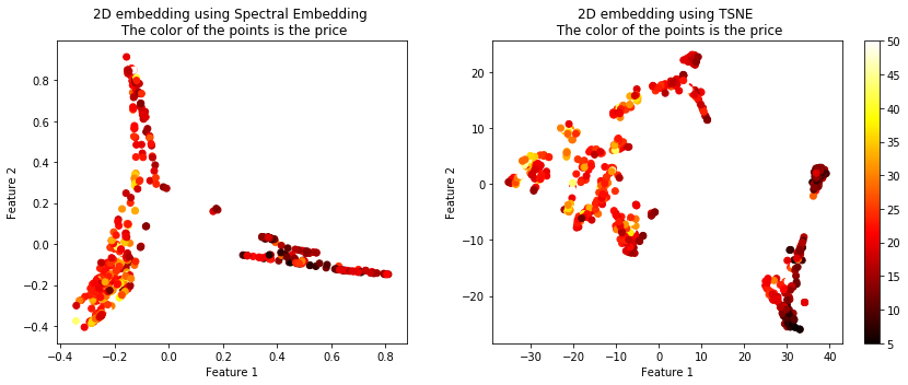
The projected data using the 4 techniques is shown below. The color of the points represents the housing price.


You can see that these 4 algorithms resulted in vastly different plots, but they all seemed to maintain the similarity between the targets. There are more options than these 4 algorithms of course. Another useful term for these techniques is called manifolds, embeddings, etc.
Check out the sklearn page: http://scikit-learn.org/stable/modules/classes.html#module-sklearn.manifold.

