I'm working on an edtech product where some of our traffic lands on webpages about textbooks.
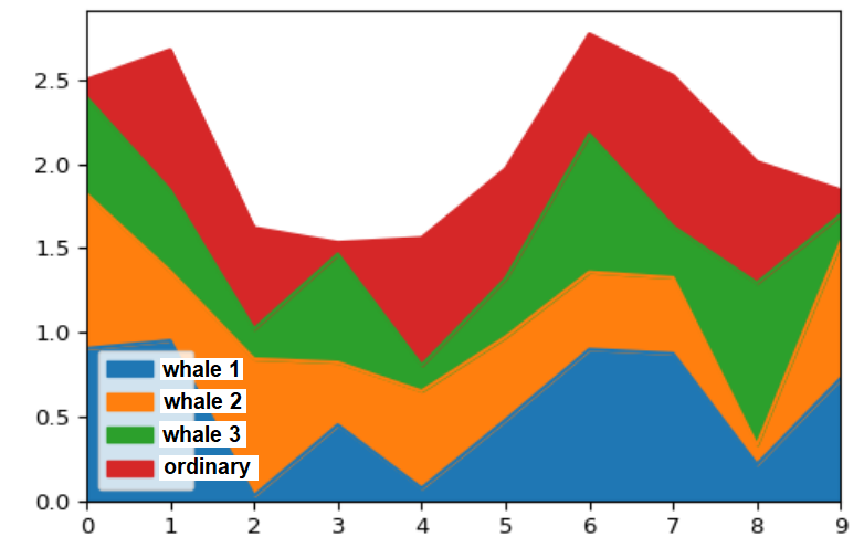
Textbooks belong to subjects like Algebra, Calculus and Spanish. In each of our subjects, we have "whales" - individual books that account for a large percent (~20%) of total subject traffic.
Year over year, these whales grow or shrink (sometimes books are replaced in a school, or schools drop textbooks altogether). This change in whale traffic contributes to a big change in overall subject traffic.
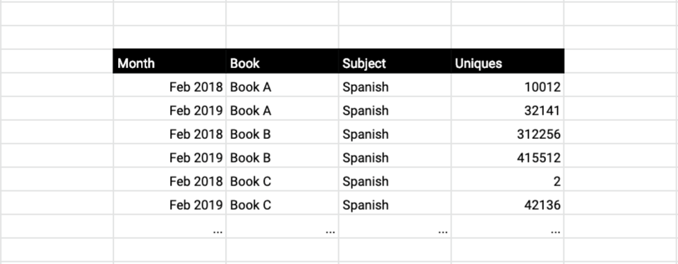
I'm trying to figure out how to visualize this change, given a dataset that looks something like the table attached below (it shows only 2 months traffic per book, but I have access to all the months).
I've tried overlapping histograms (and boxplots), where each histogram is a month. But this visualization doesn't indicate how huge my whales (outliers) are, and how much influence they have.
Any help on chart types or how to otherwise tell this story would be much appreciated.


