I'm looking at telecom customers data. Two of the variables I'm looking at currently are:
- Monthly Charges - The total amount charged to the customer monthly.
- Is Senior Citizen - Whether the customer is a senior citizen.
I'm trying to plot two histograms to see if the distributions for non-senior and senior citizens is different.
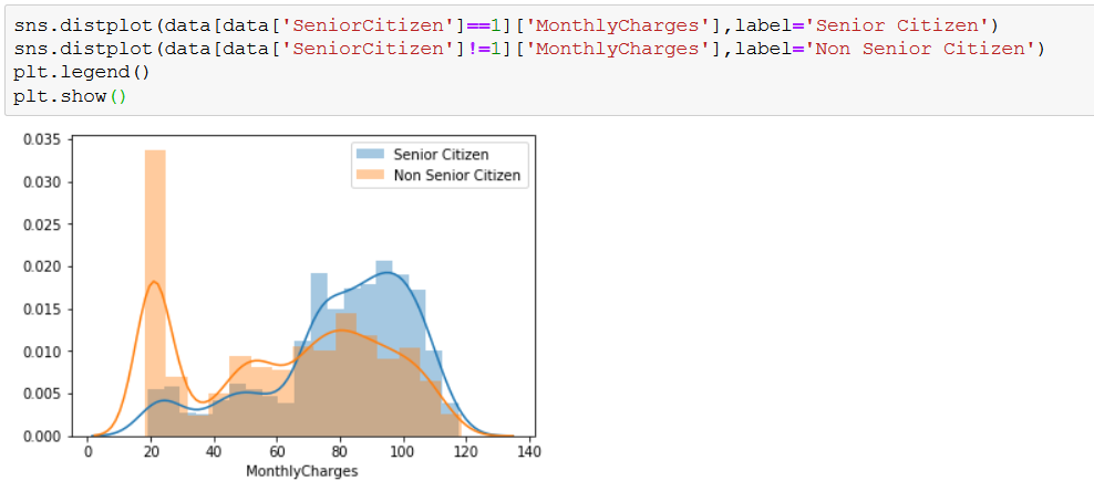
If I use seaborn's distplot then I get the following result
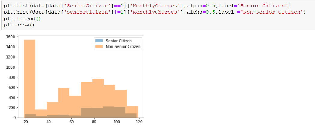
And if I use pyplot hist then I get the following result
In the first plot the blue one towers above the orange ones in the range ~70-120 whereas in the second image the blue one always stays below the orange one.
What is the difference between these two?


density=Trueargument to the call toplt.hist$\endgroup$