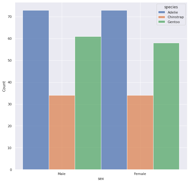
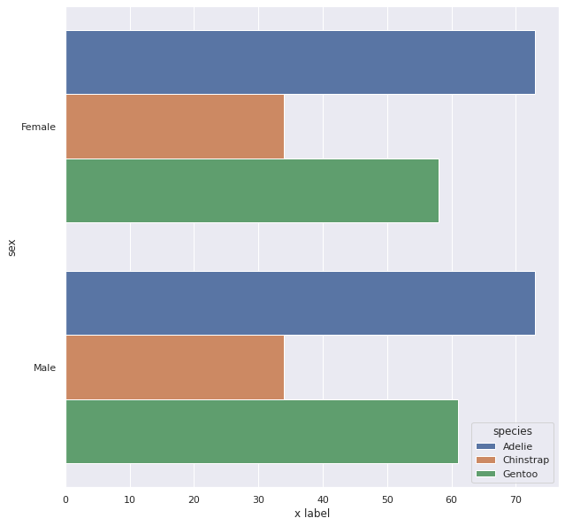
I know two approaches and use them depending on what I need and what the result looks like.
import seaborn as sns
df = sns.load_dataset("penguins")
I defined variables so you can easily compare two methods.
first_dimension = "sex"
horizontal_label = "x label"
second_dimension = "species"
Approach 1:
sns.histplot(binwidth=1,
            x=first_dimension,
            hue=second_dimension,
            data=df,
            stat="count",
            multiple="dodge")
Approach 2:
sns.barplot(x=horizontal_label,
            y=first_dimension,
            hue=second_dimension,
            data=df.groupby([first_dimension, second_dimension]).size().to_frame(horizontal_label).reset_index())


