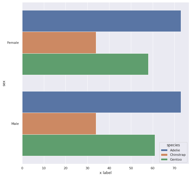
Well, there are a few ways to do the job. Here are some I thought of:
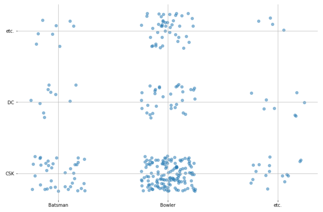
- Scatterplots with noise:
Normally, if you try to use a scatter plot to plot two categorical features, you would just get a few points, each one containing a lot of instances from the data. So, to get a sense of how many there really are in each point, we can add some random noise to each instance:
import numpy as np
import seaborn as sns
import matplotlib.pyplot as plt
%matplotlib inline

# This is to encode the data into numbers that can be used in our scatterplot
from sklearn.preprocessing import OrdinalEncoder
ord_enc = OrdinalEncoder()
enc_df = pd.DataFrame(ord_enc.fit_transform(df), columns=list(df.columns))
categories = pd.DataFrame(np.array(ord_enc.categories_).transpose(), columns=list(df.columns))

# Generate the random noise
xnoise, ynoise = np.random.random(len(df))/2, np.random.random(len(df))/2 # The noise is in the range 0 to 0.5

# Plot the scatterplot
plt.scatter(enc_df["Playing_Role"]+xnoise, enc_df["Bought_By"]+ynoise, alpha=0.5)
# You can also set xticks and yticks to be your category names:
plt.xticks([0.25, 1.25, 2.25], categories["Playing_Role"]) # The reason the xticks start at 0.25
# and go up in increments of 1 is because the center of the noise will be around 0.25 and ordinal
# encoded labels go up in increments of 1.
plt.yticks([0.25, 1.25, 2.25], categories["Bought_By"]) # This has the same reason explained for xticks

# Extra unnecessary styling...
plt.grid()
sns.despine(left=True, bottom=True)

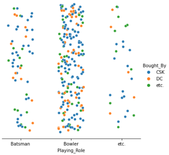
2. Scatterplots with noise and hues:
Instead of having both axis being feature we can have the $x$ axis be one feature and
the $y$ axis be random noise. Then, to incorporate the other feature, we can "colour
in" instances based on the other feature:
import numpy as np
import seaborn as sns
import matplotlib.pyplot as plt
%matplotlib inline

# Explained in approach 1
from sklearn.preprocessing import OrdinalEncoder
ord_enc = OrdinalEncoder()
enc_df = pd.DataFrame(ord_enc.fit_transform(df), columns=list(df.columns))
categories = pd.DataFrame(np.array(ord_enc.categories_).transpose(), columns=list(df.columns))

xnoise, ynoise = np.random.random(len(df))/2, np.random.random(len(df))/2

sns.relplot(x=enc_df["Playing_Role"]+xnoise, y=ynoise, hue=df["Bought_By"]) # Notice how for hue
# we use the original dataframe with labels instead of numbers.
# We can also set the x axis to be our categories
plt.xticks([0.25, 1.25, 2.25], categories["Playing_Role"]) # Explained in approach 1

# Extra unnecessary styling...
plt.yticks([])
sns.despine(left=True)

- Catplots with hues:
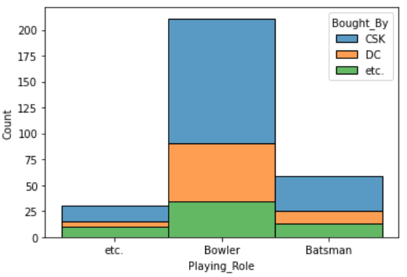
Finally, we can use catplots, and colour in fractions of it based on the other feature:
import seaborn as sns
import matplotlib.pyplot as plt
%matplotlib inline

sns.histplot(binwidth=0.5, x="Playing_Role", hue="Bought_By", data=df, stat="count", multiple="stack")
