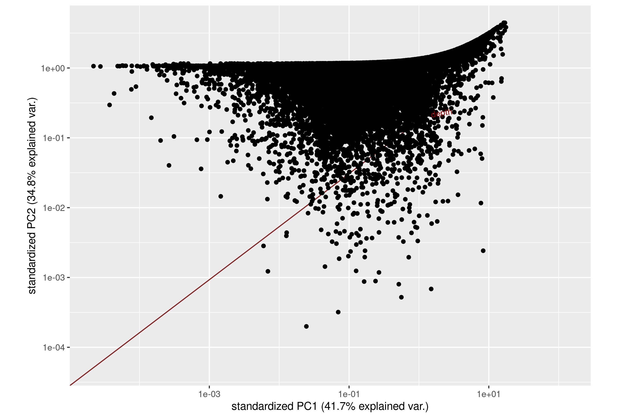
I try to plot three values of a VCF file (QUAL, DP, and rate of phasing) for all the SNPs in the file.
I thought that a PCA plot would be a good way to reduce dimensions of the plot, and to compare values although they were not on the same scale.
I have tried to build the PCA with different R packages as ggbiplot and pca3d, but its seems that the distribution of the dots cloud is always skewed as a dimension is missing. Find below the code used for generating the ggbiplot.
Would anyone have some advises to reduce three values with different scales to two-dimensional PCA?
library(devtools)
library(ggbiplot)

# Create the dataframe
df <- df[c("quality", "phasing", "depth")]

# Create the PCA dataset
pop.pca   <- prcomp(df, center = TRUE,scale. = TRUE)

# Create the plot
ggbiplot(pop.pca) +
scale_y_continuous(trans='log10') +
scale_x_continuous(trans='log10')

