1
$\begingroup$

I have a N-way frequency table generated from a regression model fit. This is a reproducible example of such table:

data("CO2")
lm.fit = lm(uptake ~  Type + Treatment, data = CO2)
lm.fit$coefficients

test = count(CO2, c('Type','Treatment'))
test$res = predict(lm.fit, newdata = test)
test$freq = NULL

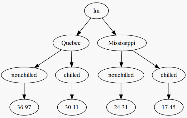
I am trying to visualize test as a decision tree with nodes as Type and Treatment and res as leaves. I would interpret it as the path the regression model takes, leading to the final value for a particular segment.

I am not able to generate a tree with test. I am also open to other novel ways of visualizing these results. My original problem has many categorical variables, so I am looking for a customizable visualization, something from party::ctree or rattle::fancyRpartPlot.

$\endgroup$

1 Answer 1

2
$\begingroup$

You could try

library(data.tree)
test$pathString <- with(test, paste("lm", Type, Treatment, round(res, 2), sep="/"))
(tree <- as.Node(test))
#             levelName
# 1  lm                
# 2   ¦--Quebec        
# 3   ¦   ¦--nonchilled
# 4   ¦   ¦   °--36.97 
# 5   ¦   °--chilled   
# 6   ¦       °--30.11 
# 7   °--Mississippi   
# 8       ¦--nonchilled
# 9       ¦   °--24.31 
# 10      °--chilled   
# 11          °--17.45 
plot(tree)

The plot uses the DiagrammeR package.

enter image description here

$\endgroup$
0

Your Answer

By clicking “Post Your Answer”, you agree to our terms of service and acknowledge you have read our privacy policy.

Not the answer you're looking for? Browse other questions tagged or ask your own question.