1
$\begingroup$

Question

What are some good plotting methods in R for examining the relationship between a target variable and various explanatory variables? In particular, I'm looking for visualization techniques that scale to more variables than the traditional scatterplot matrix.

More details

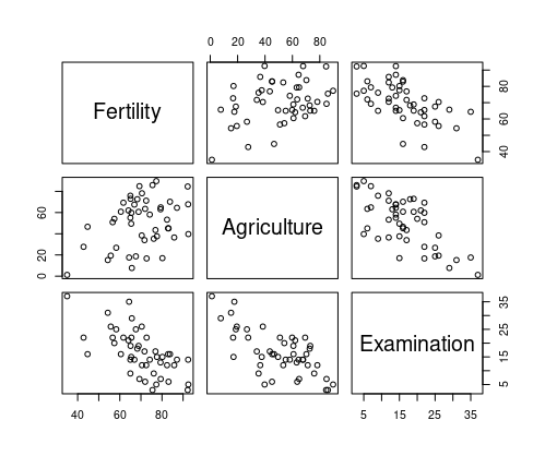
The scatterplot matrix is a great tool for visualizing pairwise relationships between variables. For example, with the swiss dataset in R, we can easily plot a matrix of scatterplots.

library(datasets)
data(swiss)
plot(swiss[1:3])

which yields

enter image description here

I am interested in the case where I want to predict some response, say Fertility using some combination of explanatory variables. I want to closely examine how each explanatory variable correlates with Fertility. If I have many columns in my dataframe, using plot(swiss) becomes unwieldy.

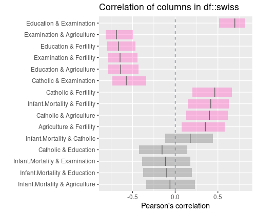
For example, the following plot (generated following instructions here) shows pairwise correlations for all columns in a dataframe. If I could plot something like this but only showing correlations between Fertility and other columns, that would be useful.

library(datasets)
data(swiss)
plot(swiss[1:3])

library(devtools)
library(inspectdf)
library(tidyverse)
library(readr)

show_plot(inspect_cor(swiss))

which yields

enter image description here

$\endgroup$

1 Answer 1

1
$\begingroup$

Below are two functions using my favorite packages:

  • The first one shows a scatterplot of every column against the target column
  • The second one shows the correlation of every column with the target column, with confidence intervals (I found how to do that with ggplot here).

Code:

library(ggplot2)
library(reshape2)
library(plyr)

scatterplot <- function(data, targetColumn='Fertility') {
  d<-melt(data,id.vars = targetColumn)
#  ggplot(d, aes_string('value',targetColumn))+geom_point()+facet_grid(variable~.)
  ggplot(d, aes_string('value',targetColumn))+geom_point()+facet_wrap(variable~.)
}


corplotCI <- function(data, targetColumn='Fertility', method='pearson') {
  d<-ldply(colnames(data), function(col) {
    if (col != targetColumn) {
      r <- cor.test(data[,col], data[,targetColumn],method=method)
      data.frame(variable=col,cor=r$estimate, lowerCI=r$conf.int[1],upperCI=r$conf.int[2])
    }
  })
  ggplot(d,aes(cor,variable))+geom_point(size=3)+geom_errorbarh(aes(xmin = lowerCI,xmax = upperCI),height=.5)+coord_cartesian(xlim=c(-1,1))
}

Usage:

scatterplot(swiss)

corplotCI(swiss)
$\endgroup$
2
  • $\begingroup$ This is excellent what I'm looking for. Thank you. How would I change the fontsize of the scatterplot subtitles or the correlation axis labels? $\endgroup$ Commented Apr 22, 2021 at 22:51
  • 1
    $\begingroup$ @nwsteg add +theme(axis.text.y = element_text(size=20)) to the ggplot line (details somewhere there) $\endgroup$
    – Erwan
    Commented Apr 22, 2021 at 23:04

Your Answer

By clicking “Post Your Answer”, you agree to our terms of service and acknowledge you have read our privacy policy.

Not the answer you're looking for? Browse other questions tagged or ask your own question.