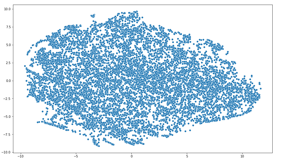
I have TV watching data and I have been trying to cluster it to get different sets of watchers. My dataset consists of 64 features (such as total watching time, percent of ads skipped, movies vs. shows, etc.). All the variables are either numerical or binary. But no matter how I treat them (normalize them, standardized, leave them as is, take a subset of features, etc.), I always end up getting pictures similar to this:
This particular picture was constructed after applying t-SNE with 2 components from the scikit-learn library. The picture is similar when using PCA and even when using both PCA and t-SNE combined.
It looks like all the watchers are pretty much the same and that we cannot divide them into clusters. But I highly doubt this. Hence, my question is: is it possible that the data is so homogeneous? Or maybe it is just not possible to visualize it like I am trying to do? Are there maybe some advanced visualization techniques?

