I think the approach below could help with aggregating some of the most pertinent classes.
Suppose there are three classes, and the classifier gets class $A$ right, but frequently misclassifies $B$ as class $C$. For example, if we have 10 samples in each class, there might be no misclassifications for $A$, whereas $B$ gets misclassified 9 samples out of 10.
Since $B$ is frequently misclassified as $C$, we could aggregate those two classes, thereby circumventing the large error rate introduced by $B$. In other words, we can interpret the misclassification rate as a similarity measure encoding suitability for aggregation in pursuit of accuracy.
Using the confusion matrix as a starting point, we can derive a class similarity matrix shaped $n_{classes} \times n_{classes}$. The similarity matrix can be seen as a 'soft grouping' of classes which highlights candidates for aggregation.
The similarity matrix would be converted to a distance matrix, whereat we can use agglomerative clustering to aggregate classes. Cross-validation could be used to assess the aggregation that yields the best accuracy-granularity trade-off.
Worked example
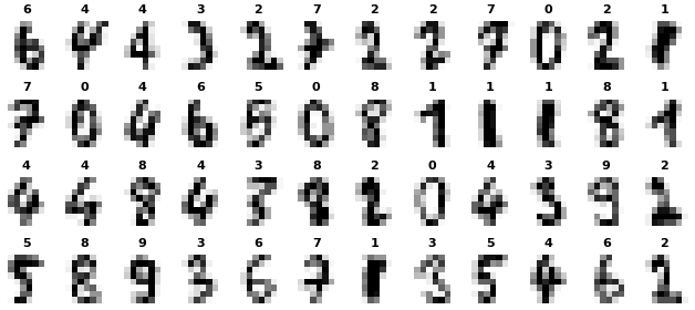
I will experiment with a digits classification dataset comprising ~1800 samples. Each sample is an 8x8 greyscale image (64 features) of a handwritten digit. There are 10 classes, representing the digits 0 to 9:

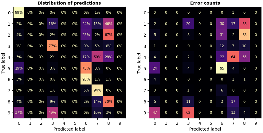
The classifier I am using performs well with some classes, but poorly with others, resulting in a low overall accuracy (44%). For example, it scores about 95% on classes [0, 6, 7], but fails to get anything right for classes [1, 2, 4, 5, 9].

The diagonal on the left image is the classifier's score for each class. The right image shows that the single largest contribution to the error rate comes from $5$ being misclassified as $6$, which happens 95 times.
Just because $5$ gets misclassified as $6$, it does not mean that the reverse is true. Thus error counts don't qualify as a similarity measure because they are not symmetric.
In order to convert the error counts to a similarity metric, a simple approach would be to sum the error matrix with its transpose, resulting in a symmetric matrix. An alternative method is to define the similarity between classes $(i, j)$ as:
$similarity[i, j] = max(\mathrm{error\_counts}[i, j], \mathrm{error\_counts}[j, i])$
This similarity metric says that, for a pair of classes $(i, j)$, their similarity is entirely defined by whichever is misclassified more often.
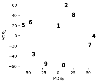
I converted the error counts to a similarity matrix as above, and then to a distance matrix. The figure below is a visualisation of the distances between classes:

Some classes end up close together, suggesting that we can aggregate a few classes and leave the rest intact. When applying hard clustering to the distance matrix, we would want $5$ and $6$ to be aggregated first, since they are the closest together.
The dendrogram (using single linkage) resulting from the distance matrix is shown on the left, coloured for one particular threshold. I ran agglomerative clustering at each linkage threshold, and scored the classifier on a validation set (right):

For this dataset and classifier, we get an accuracy boost when aggregating down from 10 classes down to 9 groups, and then no improvement if we aggregate down to 8 groups. Accuracy improves as we aggregate more classes, but at the cost of label granularity. There is a local peak at 5 clusters which could serve as another point for stopping the aggregation.
Limitations
The distance matrix is one way of deriving a sensible starting point for hard clustering. This method would work best when a class is incorrectly assigned to mainly one other class, as there is a clear grouping in that case. If a class has errors distributed over several other classes, then aggregating it with just one could lead to a decrease in accuracy.
Reproducible example
Load and view digits dataset from sklearn:
import numpy as np
from matplotlib import pyplot as plt

from sklearnex import patch_sklearn
patch_sklearn()

from sklearn.datasets import load_digits
from sklearn.model_selection import train_test_split
from sklearn.preprocessing import StandardScaler

#Split the data - just a train and val set for the purposes of this demo
X, y = load_digits(return_X_y=True, as_frame=False)

classes = np.unique(y)
n_classes = classes.size

X_trn, X_val, y_trn, y_val = train_test_split(
    X, y, random_state=0, stratify=y, test_size=0.30
)

scaler = StandardScaler().fit(X_trn)

f, axs = plt.subplots(nrows=4, ncols=12, figsize=(8, 3.5))
for i, ax in enumerate(axs.ravel()):
    ax.imshow(X_trn[i].reshape(8, 8), cmap='Greys')
    ax.axis('off')
    ax.set_title(str(y_trn[i]), fontsize=8, weight='bold')
Fit a strongly-regularised DecisionTreeClassifier and view the confusion matrices:
import numpy as np

from sklearn.tree import DecisionTreeClassifier
from sklearn.metrics import ConfusionMatrixDisplay

model = DecisionTreeClassifier(min_samples_leaf=200, random_state=0).fit(X_trn, y_trn)
print(model.score(X_trn, y_trn), model.score(X_val, y_val))

use_X, use_y = X_val, y_val
use_X, use_y = X_trn, y_trn

mask_in_errors = (model.predict(use_X) != use_y)

f, axs = plt.subplots(nrows=2, ncols=2, figsize=(9, 9), layout='tight')
axs = axs.ravel()

plot_kwargs = dict(colorbar=False, text_kw={'size': 8.5, 'weight': 'regular'}, cmap='magma')
title_kwargs = dict(fontsize=10, fontweight='bold')

ax = axs[0]
ConfusionMatrixDisplay.from_estimator(
    model, use_X, use_y, sample_weight=None, normalize='true', values_format='.0%', ax=ax,
    **plot_kwargs,
)
ax.set_title('Distribution of predictions', **title_kwargs)

ax = axs[1]
ConfusionMatrixDisplay.from_estimator(
    model, use_X, use_y, sample_weight=mask_in_errors, normalize=None, ax=ax,
    **plot_kwargs
)
ax.set_title('Error counts', **title_kwargs)

ax = axs[2]
ConfusionMatrixDisplay.from_estimator(
    model, use_X, use_y, sample_weight=mask_in_errors, normalize='true',
    **plot_kwargs, values_format='.0%', ax=ax
)
ax.set_title('Error % row-wise', **title_kwargs)

ax = axs[3]
ConfusionMatrixDisplay.from_estimator(
    model, use_X, use_y, sample_weight=mask_in_errors, normalize='pred',
    **plot_kwargs, values_format='.0%', ax=ax
)
ax.set_title('Error % col-wise', **title_kwargs)

if False:
    #Sharex/y
    [ax.set(xlabel='', ylabel='') for ax in axs]
    [ax.set_ylabel('True label') for ax in axs[[0, 2]]]
    [ax.set_xlabel('Predicted label') for ax in axs[[2, 3]]]
plt.show()

#Global error attribution
misclas = model.predict(use_X) != use_y
errors_perclass_pct = np.array([
    misclas[use_y==clas].sum().__truediv__(misclas.sum()).__mul__(100) for clas in classes
])

errors_classes_sorted = list(zip(
    errors_perclass_pct[np.argsort(errors_perclass_pct)[::-1]].round().astype(int),
    classes[np.argsort(errors_perclass_pct)[::-1]]
))

print(
    'Error attribution (global errors %, class): \n',
    *errors_classes_sorted
)
Derive the distance matrix, and visualise it by 'inverting' the distances using MDS:
#To distance matrix
from sklearn.metrics import confusion_matrix
error_counts = confusion_matrix(use_y, model.predict(use_X), sample_weight=mask_in_errors)
similarity_matrix = np.stack([np.tril(error_counts), np.triu(error_counts).T], axis=2).max(axis=2)
similarity_matrix = similarity_matrix + similarity_matrix.T

distance_matrix = (similarity_matrix - similarity_matrix.max()).__abs__()
np.fill_diagonal(distance_matrix, 0)

#View similarity & dissimilarity matrices
import seaborn as sns
common_params = dict(annot=True, cmap='magma', mask=np.eye(n_classes), cbar=False)

ax = plt.subplot(121)
sns.heatmap(similarity_matrix, ax=ax, **common_params)

ax = plt.subplot(122)
sns.heatmap(distance_matrix, ax=ax, **common_params)
plt.gcf().set_size_inches(10, 4)
plt.show()

#visualise class relative locations based on dissimilarity
from sklearn.manifold import MDS
xy = MDS(dissimilarity='precomputed', n_jobs=-1, random_state=0).fit_transform(distance_matrix)

for clas, (x, y) in zip(classes, xy):
    plt.scatter(x, y, marker=f'${clas}$', s=100, color='black')
plt.gcf().set_size_inches(3.5, 3)
plt.gca().set(xlabel='MDS$_0$', ylabel='MDS$_1$')
plt.gca().spines[:].set_visible(False)
View dendrogram using scipy.hierarchy:
from scipy.cluster.hierarchy import linkage, dendrogram, fcluster
from scipy.spatial.distance import squareform

Z = linkage(squareform(distance_matrix), method='single')

cut_at = 34.5
dendro = dendrogram(
    Z,
    orientation='right',
    labels=[f'class {i}' for i in classes],
    color_threshold=cut_at
)
ax = plt.gca()

ax.axvline(cut_at, lw=6, alpha=0.3, color='blue')
ax.axvline(cut_at, lw=3, alpha=0.2, color='red')

ax.figure.set_size_inches(8, 3.5)
ax.spines[['top', 'right', 'left']].set_visible(False)
ax.set_xlabel(f'linkage distance')
ax.tick_params(axis='y', labelsize=10, rotation=15, left=True, width=3, color='dimgray')
Use validation set to tune the accuracy-granularity trade-off:
np.random.seed(10)

val_scores_dict = {}
trn_scores_dict = {}

Z[0, 2] += 1e-10 #enforce non-zero, to separate from intially having separate classes
for linkage_distance in [0] + Z[:-1, 2].tolist():
    clusters = fcluster(Z, t=linkage_distance, criterion='distance') - 1

    y_trn_clustered = np.empty_like(y_trn)
    y_val_clustered = np.empty_like(y_val)
    for clas, cluster_id in zip(classes, clusters):
        y_trn_clustered[y_trn==clas] = cluster_id
        y_val_clustered[y_val==clas] = cluster_id

    n_clusters = np.unique(clusters).size
    model.fit(X_trn, y_trn_clustered)
    val_scores_dict[n_clusters] = model.score(X_val, y_val_clustered) * 100
    trn_scores_dict[n_clusters] = model.score(X_trn, y_trn_clustered) * 100

    print(
        n_clusters, 'clusters | class memberships:',
        *[classes[clusters==cid].tolist() for cid in np.unique(clusters)]
    )

plt.plot(
    val_scores_dict.keys(), val_scores_dict.values(),
    marker='o', color='crimson', label='validation'
)
plt.plot(
    trn_scores_dict.keys(), trn_scores_dict.values(),
    marker='o', linestyle='--', color=(0.6,)*3, label='train', zorder=0
)

plt.gcf().set_size_inches(5, 2)
plt.gca().spines[['top', 'right']].set_visible(False)
plt.xlabel('number of clusters')
plt.ylabel('accuracy (%)')
plt.gca().invert_xaxis()
plt.legend(ncols=1, shadow=True, fancybox=True, framealpha=1)

ax2 = plt.gca().secondary_xaxis(location=-0.4)
ax2.set_xticks([2, n_classes], ['coarse', 'granular'])
ax2.spines.bottom.set_bounds(2, n_classes)
The code above generates a plot and reports cluster memberships:
10 clusters | class memberships: [3] [9] [0] [5] [6] [4] [7] [2] [8] [1]
9 clusters  | class memberships: [3] [9] [0] [5, 6] [4] [7] [2] [8] [1]
8 clusters  | class memberships: [3] [9] [0] [5, 6] [4] [7] [2, 8] [1]
7 clusters  | class memberships: [3] [9] [0] [5, 6] [4, 7] [2, 8] [1]
6 clusters  | class memberships: [3, 9] [0] [5, 6] [4, 7] [2, 8] [1]
5 clusters  | class memberships: [3, 9] [0] [5, 6] [4, 7] [1, 2, 8]
4 clusters  | class memberships: [0, 3, 9] [5, 6] [4, 7] [1, 2, 8]
3 clusters  | class memberships: [0, 3, 9] [5, 6] [1, 2, 4, 7, 8]
2 clusters  | class memberships: [0, 3, 9] [1, 2, 4, 5, 6, 7, 8]

