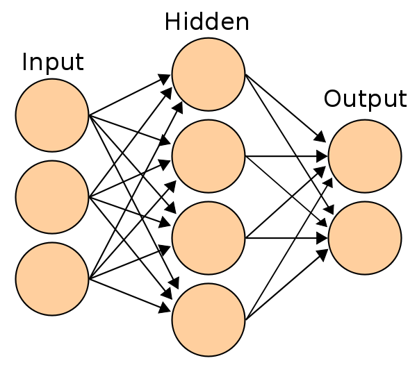
This image looks pretty familiar to anyone getting acquainted with neural networks, and on first glance it makes a lot of intuitive sense.
But on second, third, fourth, etc glance, some questions pop up! I hope I'm not the only one with these concerns.
There are 3 circles representing Input nodes. Does this mean that the data sent into the NN has to be separated into multiple batches? I don't hear much talk of that, or any kind of emphasis / reasoning. Why don't we send the data through the network all at once? Can't the video card handle it? (Or is that the reason why right there, that the card can't handle it?).
There are 4 circles representing Hidden nodes. Each previous node points to
a Hidden one. The way this is show, it is confusing:
Does this mean that data coming in is somehow merged together? I see 3 arrows all coalescing together into the next layer. That's what it looks like visually.
Is there some order, or sequence here? There's no indication of this process happening in some order. It just looks like a mess of arrows pointing from Input to Hidden. Shouldn't be be concerned with the order in which these activations flow? After all, we are looking at a network graph.
There are 2 circles representing Output nodes. Is this showing that a NN can output 2 different sets of data?? Why do we want multiple outputs? We started with 3 blocks of data, now we have 2. How are 2 separate blocks of data going to help us make a binary choice on, say, image classification?
The more I look at this image, the more I dislike it. Yet I see it everywhere, in many introductory / intermediate discussions of NN. I'm hoping there is a reason why such an unclear image is so popular.

