Suppose, we use the following code to generate scatter plots,
function res = plot2features(tset, f1, f2)
% Plots tset samples on a 2-dimensional diagram
%   using features f1 and f2
% tset - training set; the first column contains class label
% f1 - index of the first feature (mapped to horizontal axis)
% f2 - index of the second feature (mapped to vertical axis)
%
% res - matrix containing values of f1 and f2 features

    % plotting parameters for different classes
    %   restriction to 8 classes seems reasonable
    pattern(1,:) = 'ks';
    pattern(2,:) = 'rd';
    pattern(3,:) = 'mv';
    pattern(4,:) = 'b^';
    pattern(5,:) = 'gs';
    pattern(6,:) = 'md';
    pattern(7,:) = 'mv';
    pattern(8,:) = 'g^';

    res = tset(:, [f1, f2]);

    % extraction of all unique labels used in tset
    labels = unique(tset(:,1));

    % create diagram and switch to content preserving mode
    figure;
    hold on;
    for i=1:size(labels,1)
        idx = tset(:,1) == labels(i);
        plot(res(idx,1), res(idx,2), pattern(i,:));
    end
    hold off;
end
The following is its usage,
>> plot2features(train, 3,4)
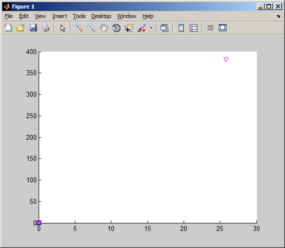
This code generates the following image before removing outliers,
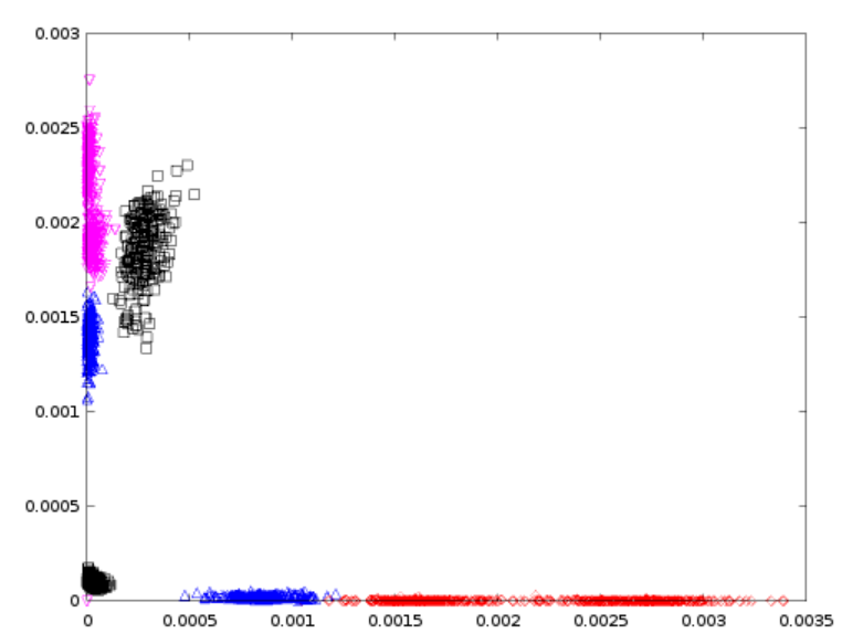
and following image after removing outliers,
I have the following questions,
(1) What do the 1st image tell us about the existence of outliers? I can guess that the plot at a distant position is an outlier. But, how can I find which row or column is generating outliers? according to the 1st picture, the outlier is situated at (27,375) coordinates. But, in the actual data it is situated on the train(184:188,:) rows. So, why is that difference?
(2) What do the color codes in the second picture represent?
(3) Why has the two images that much different? Why only removing 4 rows bring so radical differnce?
(4) How can we analyze the existence of outliers using histograms? Please, supply me any study material about outlier detection using histograms.
Suppose we have the following training and test data in our hands to be used in testing Bayes Classifier algorithm,
Training data
Test data
First column represents class. Rest of the columns represent features.


