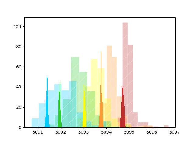
It's my first question here and I hope it's not too simple for a data science question.
I'm looking for a clear and less typical way to visualize my data. I have two data sets here - first one hatched and semi-transparent and the other one non-transparent fully-colored. I'd like to emphasize how the hatched histograms are widening while the fully-colored ones are not. I also want to keep something that shows that the data in hatched and non-hatched correspond with each other as I did in this histogram with the colors - red full-colored histogram data corresponds to red hatched data. Any ideas how to visualize it differently? Is the visualization presented here good enough to show the things I described here?

