For my evaluation, I have three different time-series data of the following format with different characterstics where the first column is timestamp and the second column is the value.
0.086206438,10
0.086425551,12
0.089227066,20
0.089262508,24
0.089744425,30
0.090036815,40
0.090054172,28
0.090377569,28
0.090514071,28
0.090762872,28
0.090912691,27
For reproduciability, I have shared the three time-series data I am using here.
From column 2, I wanted to read current row and compare it with the value of the previous row. If it is greater, I keep comparing. If the current value is smaller than the previous row's value continue, I take the difference. Let me make it clear. For example in the above sample record I provided, the seventh row (28) is smaller than the value in the sixth row (40) - so it will be (40-28 =12).
Here is my sample code.
import numpy as np
import pandas as pd
import csv
import numpy as np
import scipy.stats
import matplotlib.pyplot as plt
import seaborn as sns
from scipy.stats import norm
from statsmodels.graphics.tsaplots import plot_acf, acf


protocols = {}


types = {"data1": "data1.csv", "data2": "data2.csv", "data3": "data3.csv"}

for protname, fname in types.items():
    arr = []
    arr1 = []
    with open(fname, mode='r', encoding='utf-8-sig') as f:
        reader = csv.reader(f, delimiter=",")
        for i in reader:
            arr.append(int(i[1]))
            arr1.append(float(i[0]))

    arr, arr1 = np.array(arr), np.array(arr1)
    diffs = np.diff(arr)
    diffs1 = np.diff(arr1)
    diffs1 = diffs1[diffs > 0]
    diffs = diffs[diffs > 0] # To keep only the increased values
    protocols[protname] = {
        "rtime": np.array(arr1),
        "rdata": np.array(arr),
        "data": diffs,
        "timediff": diffs,
    }

## change in time
for protname, values in protocols.items():
    d = values["rdata"]
    t = values["rtime"]
    d = np.diff(d, 1) #/ d[:-1]
    t = np.diff(t, 1)
    plt.plot(t[d < 0], d[d < 0], ".", label=protname, alpha=0.5)
    plt.xlabel("Changes in time")
    plt.ylabel("differences")
    plt.legend()
    plt.show()
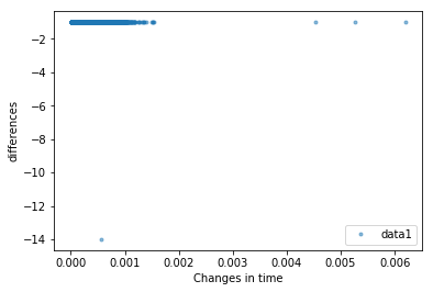
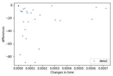
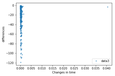
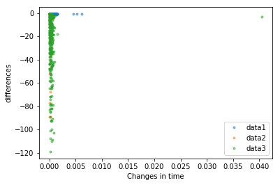
This gives me the following plots
However, this doesn't seem to give me a good option to classify these time-series data. I wanted to do it using Kolmogorov–Smirnov test. How can do it using a two-sample KS test in Python?


