3
$\begingroup$

I want to plot the graph with datetime . I saw so many questions similiar to my questions. But that answers didn't work for me. Here is the code that I used:

 data = pd.read_csv('p1.csv')
 df1 = pd.DataFrame(df1, columns=['date', 'time', 'x1', 'x2','x3'])
 data['date_time'] = pd.to_datetime(data['date'] + ' ' + data['time'])
data['date_time'] = pd.to_datetime(data['date_time'], format='%m/%d/%Y %H:%M:%S')
data.set_index('date_time',inplace = True)
plt.plot(data.index, data.x2)

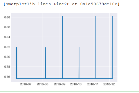
Plot graph : enter image description here

Can anyone suggest me a solution for this?

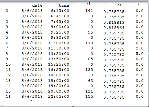
CSV file after reading it:

enter image description here

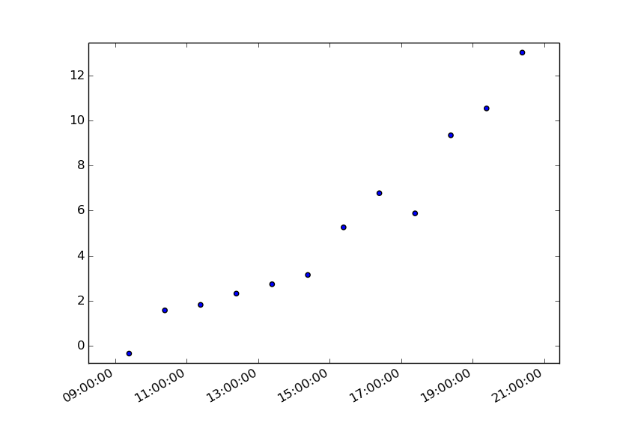
I want to plot like this but with date: enter image description here

$\endgroup$
2
  • $\begingroup$ Can you please add the full dataframe(what 'data' looks like)? $\endgroup$
    – yoav_aaa
    Commented Feb 18, 2019 at 14:16
  • $\begingroup$ @yoav_aaa I added the image of the dataframe and I changed the code also $\endgroup$
    – user59020
    Commented Feb 18, 2019 at 15:45

1 Answer 1

1
$\begingroup$

First, in order to plot three different lines with a 4-hour interval, you will need to resample your data. (This is how you get your frequency conversion). You can read about that more here.

pd.resample()

Then as long as all three of your "lines" are contained in the same data frame, you should have no problem plotting them by just calling

three_lines = your data frame

plt.plot(three_lines)

Although one note - just looking at your data, you might not get the desired result given the scale difference in your data. Said a different way, the values < 1 might be minimally visible when plotted on the same figure as values ranging around 100.

Hope this helps. Please drop a comment if you need any further clarification.

$\endgroup$
4
  • $\begingroup$ Thank you for the great wxplanation . I have a question, If I have date series I mean 8/6/2018 I have a dataset and then I have a dataset 9/6/2018, then again I have a datset 10/6/2018. So how I can write date_range ? $\endgroup$
    – user59020
    Commented Feb 19, 2019 at 3:21
  • $\begingroup$ Yes , I'm also stuck with this error. $\endgroup$
    – user59020
    Commented Feb 19, 2019 at 16:50
  • $\begingroup$ So to clarify, there is no time overlap between any of the data points you wish to plot? $\endgroup$
    – Ethan
    Commented Feb 19, 2019 at 19:41
  • $\begingroup$ to get the idea i upload the pic like what i want to plot $\endgroup$
    – user59020
    Commented Feb 20, 2019 at 3:36

Your Answer

By clicking “Post Your Answer”, you agree to our terms of service and acknowledge you have read our privacy policy.