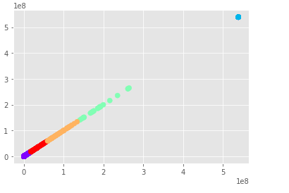
I have done and read a csv file and then plotted the values of a single column using K-means
import pandas as pd
import numpy as np
import matplotlib.pyplot as plt
from matplotlib import style
style.use("ggplot")
from sklearn.cluster import KMeans

data=pd.read_csv(r'Plot_file.csv', encoding='unicode_escape', sep=';')
data.head()

feature_names = ['Plot_Column]
X = np.asarray(data[feature_names])

from sklearn.cluster import KMeans

labels = KMeans(5, random_state=10).fit_predict(X)
plt.scatter(X[:, 0], X[:, 0], c=labels,
    s=50, cmap='rainbow');
The output looks like this, it is linear because when clustering one column it can only look at the relative distance between the values in that column and will always be linear on any chart as it is only clustering one dimension
How would I go with detecting anomalies in this case?
The column that I am clustering the values from has around 12 thousand rows and varying numbers.

