So, after a lot of digging, I found something in the comment section.
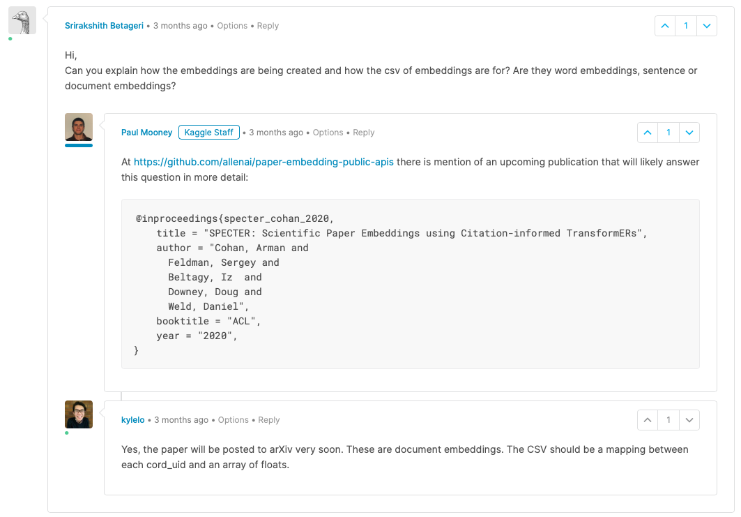
They are document embeddings.

Relevant Comments from the Kaggle Comment section on the Data Update Log for the CORD19 Dataset:
Examples how to visualize the embeddings in a Jupyter Notebook:
import pandas as pd
from whatlies import Embedding, EmbeddingSet
#Docs: https://rasahq.github.io/whatlies/api/embeddingset/


#transponse dataframe
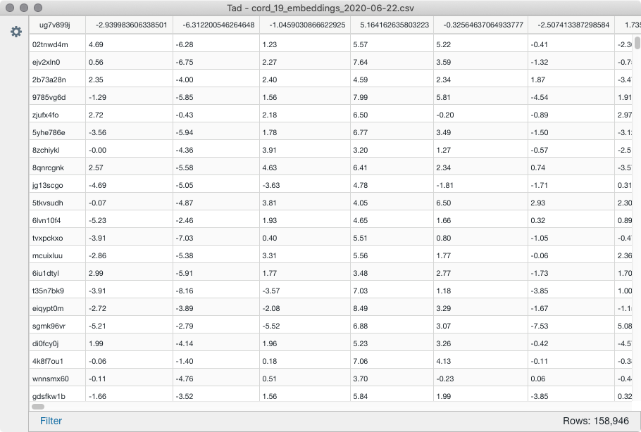
sample_df = pd.read_csv('data/cord_embeddings_sample.csv', header=None, delimiter=',', index_col=0).T

def to_ems(df):
    ems_dict = {}
    for columnName, columnData in df.iteritems():
        ems_dict.update({str(columnName): Embedding(columnName, columnData)})
    return EmbeddingSet(ems_dict)

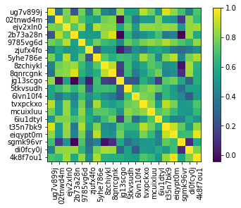
ems = to_ems(sample_df.head(10))
ems.plot_correlation()

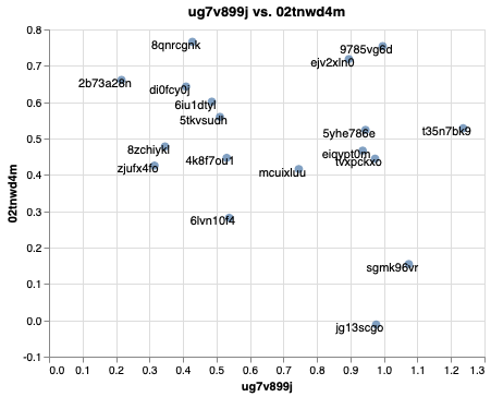
ems.plot_interactive("ug7v899j","02tnwd4m")

You can even do NLP with the jsons from the dataset and link them to the embeddings via the UUID and SHA from metadata.csv.
Example:
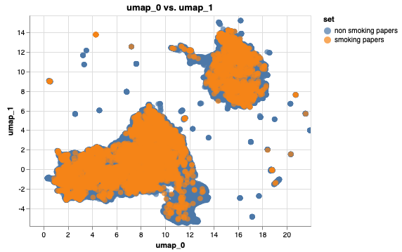
Find words that relate to smoking and color the respective papers:
I created 2 EmbeddingSets where I filtered the embeddings for papers that have smoking-related words in their text body and subtracted their UUIDs from the list.
Both EmbeddingSets can be displayed in the plot.
from whatlies.transformers import Umap

# add 2 embedding sets

emb1 = non_smoking_ems.add_property('set', lambda d: 'non smoking papers')
emb2 = smoking_ems.add_property('set', lambda d: 'smoking papers')

both = emb1.merge(emb2)

#add a clustering transformer that reduces dimensionality (like umap) and visualise them
both.transform(Umap(2)).plot_interactive('umap_0', 'umap_1',color='set', annot=False)
