I'm studying the Spotify streams trend for different nations in order to show the impact of the pandemic on music listeners.
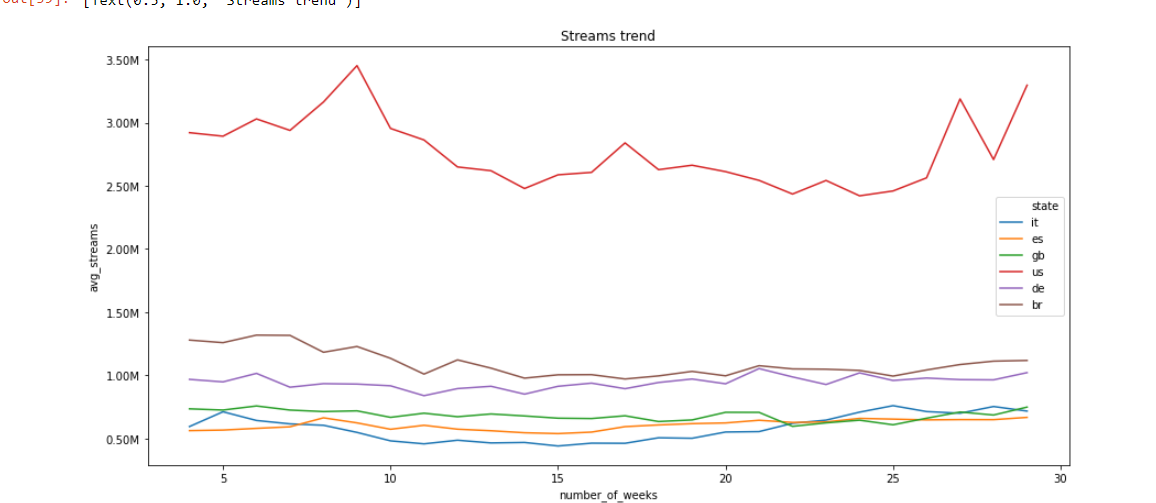
So far i retrieved my data, and plotted it.
Obviously, since the various nations have different numbers in population, spotify users ecc... this graphic doesn't tell much.
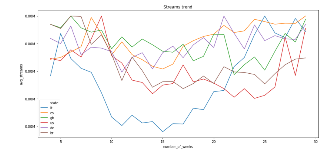
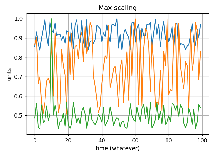
So i decided to scale every curve dividing its values by its peak.
So for example, the US has a maximum value of 3.50 million streams, i normalized that curve with that value and i did the same for all the other states (with their maximum value) and I obtained this:
Could this be a good approach? In general which approach should I use if i want to compare different curves which have a really big difference in absolute values?
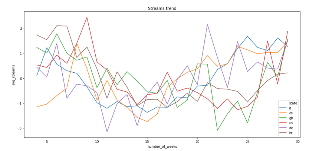
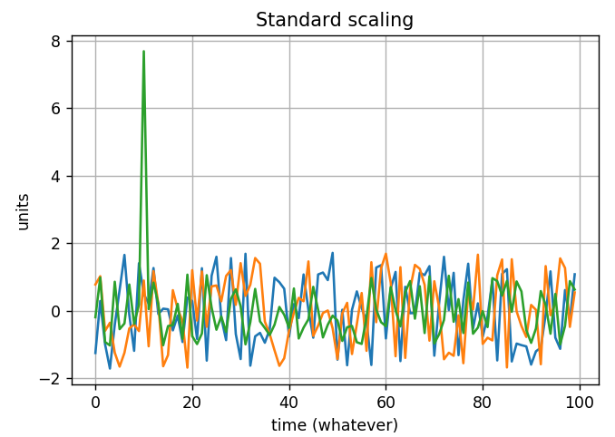
EDIT : In the end i normalized my data using a zscore normalization for each single line. So basically I computed the mean and standard deviation for each state and then I normalized the single state with its mean and std.
This is the resulting plot:
Is this a good approach? Can I now compare the different trends and conclude that there's an overall decrease in the period between 10 and 15 weeks?

