4
$\begingroup$

I am trying to visualize a dataset that registers the career of people in an organisation and their backgrounds before starting in that particular organisation. I 'd like to show how individuals are positioned in the space based on their background areas and show the evolution through time in the beginning of each decade. I have seen the answers here but my data are much more categorical and also, ideally, I 'd like to display all three background categories (see below) at the same time

A sample of my data follows:

Person  BkgArea1    BkgArea2    BkgArea3    TotalSize   YearFrom    YearTo
P1  3   2   0   5   1959    1965
P2  0   2   1   3   1959    1967
P3  3   0   2   5   1991    2008
P4  3   0   0   3   1959    1980
P5  3   0   0   3   1981    1998
P6  0   2   1   3   2006    2014
P7  2   2   2   6   2008    2014
P8  0   0   3   3   1991    1996
P9  3   3   1   7   1966    1972
P10 3   0   2   5   1975    1991
P11 3   2   0   5   1998    2013
P12 3   1   0   4   2004    2013
P13 0   2   0   2   1998    2010
P14 0   3   0   3   2003    2008
P15 1   2   3   6   1998    2008
P16 3   0   2   5   1973    1977
P17 1   3   0   4   1998    2012
P18 3   0   2   5   1996    2008
P19 0   3   1   4   1998    2011
P20 3   2   0   5   1998    2006
P21 3   0   0   3   1986    1989
P22 0   3   2   5   1996    2014
P23 3   2   3   8   1959    1976
P24 3   2   0   5   1998    2001
P25 0   0   3   3   1998    2011
P26 3   3   2   8   1965    1992
P27 2   3   2   7   2010    2014
P28 3   2   2   7   1986    1998
P29 3   3   0   6   2013    2014
P30 0   3   2   5   1976    1977
P31 3   3   0   6   1986    1987
P32 0   2   2   4   1980    1990
P33 3   0   2   5   1975    1986
P34 0   3   3   6   1977    1991
P35 3   2   2   7   1963    1974
P36 3   3   0   6   1998    2001
P37 0   2   3   5   1998    2004
P38 0   3   2   5   1974    1980
P39 3   2   3   8   1989    1998
P40 0   3   3   6   1991    1998
P41 0   1   2   3   1998    2001
P42 0   2   0   2   2003    2012
P43 3   3   3   9   1973    1986
P44 3   2   1   6   1978    1986
P45 0   2   0   2   2002    2012
P46 0   3   3   6   1982    1988
P47 0   3   0   3   1992    1998
P48 3   2   2   7   1998    2004
P49 2   2   0   4   2012    2014
P50 3   2   2   7   2008    2014

The values in columns BkgArea1-3 are essentially categorical values, that indicate the strength of an individual in a specific category. It is thus 0: no background, 1: weak background, 2: average background, 3: strong background. The TotalSize column is the sum of the scores of the individuals

The initial idea was to assign basic colors to BkgAreas 1-3, namely Red, Green, Blue, and then colour the individuals according to the mixture of their backgrounds, weighing each color with the strength of each area, i.e. 2/3 * Red if an individual has score 2 in BkgArea1, etc. I then tried to display the area as 3d scatter plot but it looks very complicated and hard to interpret.

I also tried to apply Multiple Correspondence Analysis but I haven't got very satisfying results. Do you have any ideas as of how to represent this dataset?

UPDATE

After people having posted various useful answers but not 100% covering the representation needs, I summarize what I would like to achieve:

  1. Group/cluster the individuals according to their backgrounds and relative to the three background areas. if someone has scores in more than one of them, they should be displayed somewhere in the middle.
  2. Show, visually if possible, the number of individuals and the TotalSize of the individuals. This could be a cloud
  3. Show the development of the organization. I think this might be easy to do with stacked column charts or histograms

RadViz can be a method to solve 1 and 2, or at least I am inclined toward that representation. The problem in my data is that individuals under RadViz will be placed at very specific points so we lose somewhat the track of how many individuals have specific background characteristics

$\endgroup$

4 Answers 4

3
$\begingroup$

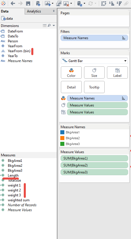
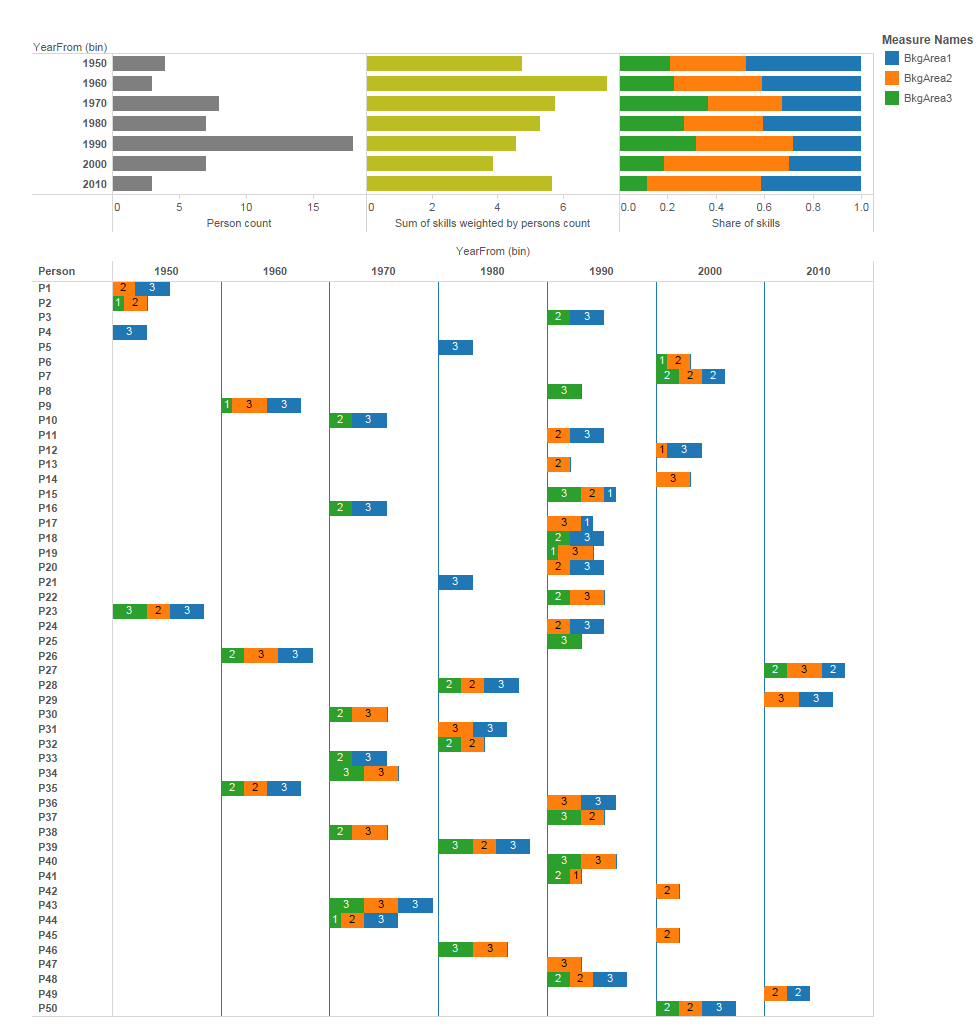
This is something you can get in Tableau in 10 minutes.

enter image description here

What you need is year binning, skills weights and length(year_end - year_start) for Gannt chart:

enter image description here

$\endgroup$
3
  • $\begingroup$ and pay 6 figures for if you want to deploy it in an enterprise $\endgroup$
    – hrbrmstr
    Commented Nov 6, 2015 at 18:29
  • $\begingroup$ @IharS. Thank you for the answer. It gives a very good overview of the development over time. Ideally, I would also like to have the individuals grouped according to similarity of their backgrounds $\endgroup$
    – Yannis P.
    Commented Nov 7, 2015 at 17:45
  • $\begingroup$ @hrbrmstr the same you can get in any BI tool. I've just shown the concept $\endgroup$
    – IgorS
    Commented Nov 7, 2015 at 18:24
2
$\begingroup$

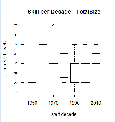
Slightly variation of the @init-random's first plot is use of Boxplot. Here example for the TotalSize using same setup for d

 xy <- boxplot(TotalSize ~ start.decade    ,   
 data =  d,        
 ylab="sum of skill levels", xlab="start.decade", main= "Skill per Decade - TotalSize")

Boxplot

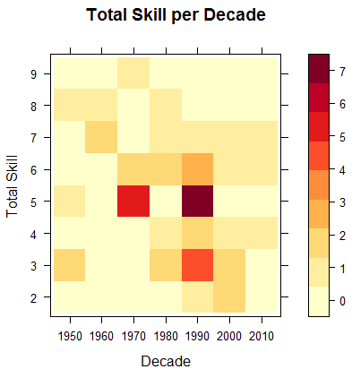
But this actually ignores the factor and interprets it as numbers. To draw a factor frequency in time, you may use levelplot interpreting the third dimension as color.

 library(lattice)
 library(RColorBrewer)
 library(reshape)

 df <- data.frame(d)
 df <- as.data.frame.matrix(table(df[,c("TotalSize","start.decade")]))
 df$TotalSize <- rownames(df)
 library(reshape)
 dfm <- melt(df, id = c("TotalSize"))
 colnames(dfm) <- c("TotalSize", "decade", "count")
 dfm$decade <- as.factor(dfm$decade)
 dfm$TotalSize <- as.factor(dfm$TotalSize)

 xy <- levelplot(count ~ decade + TotalSize , data=dfm, cuts=8, 
 col.regions=brewer.pal(9,"YlOrRd")  ,   
 ylab="Total Skill", xlab="Decade", main= "Total Skill per Decade")
 print (xy)

level plot

$\endgroup$
1
$\begingroup$

There might be a couple of different things you could do.

library(data.table)
d <- data.table(read.csv('/tmp/x.csv', sep='\t', quote='', header=T, na.strings=''))
# bucket start date to decade
d[, start.decade:=10*floor(YearFrom/10)]
# create quantiles to represent the inner quartile range
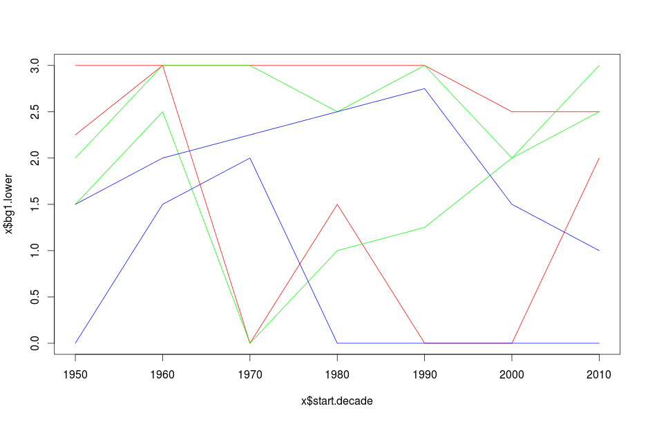
xy.plot <- d[, .(bg1.lower=quantile(BkgArea1, .25),
       bg1.upper=quantile(BkgArea1, .75),
       bg2.lower=quantile(BkgArea2, .25), 
       bg2.upper=quantile(BkgArea2, .75), 
       bg3.lower=quantile(BkgArea3, .25), 
       bg3.upper=quantile(BkgArea3, .75)), by=start.decade]
plot(xy.plot$start.decade, xy.plot$bg1.lower, col='red', type='l')
lines(xy.plot$start.decade, xy.plot$bg1.upper, col='red')
lines(xy.plot$start.decade, xy.plot$bg2.lower, col='green')
lines(xy.plot$start.decade, xy.plot$bg2.upper, col='green')
lines(xy.plot$start.decade, xy.plot$bg3.lower, col='blue')
lines(xy.plot$start.decade, xy.plot$bg3.upper, col='blue')

enter image description here

I think this is a little messy. You could just show one pair at a time.

Mosaic plots are nice for categorical data. The relative area is the density of users in the cross-sectional pair. Changing the numbers to text would make it more clear.

mosaicplot(BkgArea1 ~ BkgArea3 + BkgArea2, d[start.decade==2010])

enter image description here

You could have one per decade or visualize the total column against the decade, depending on what you want.

$\endgroup$
1
  • $\begingroup$ @init-ramdom thanks for the ideas. I need to test them carefully and get back to you. The only thing I don't see is how to incorporate the size but anyways mosaic seems to be a good idea $\endgroup$
    – Yannis P.
    Commented Nov 2, 2015 at 17:28
1
$\begingroup$

Update

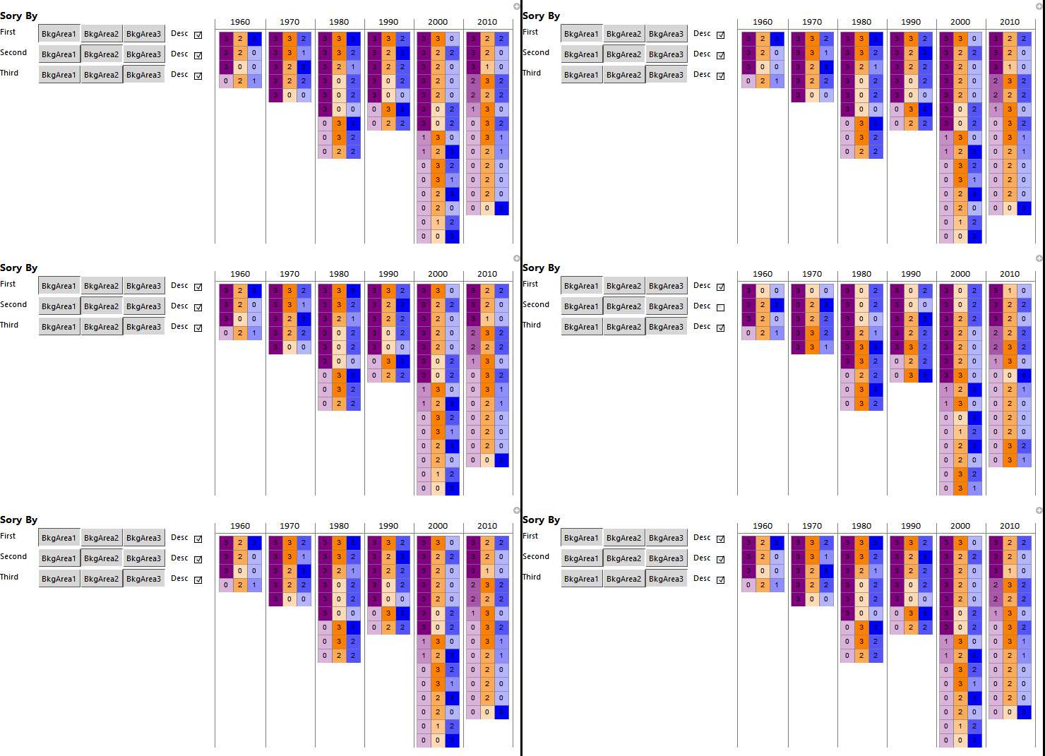
Picking up from where we left off in the original post a quick interactive view to of the background areas can be made. I show this in a gif file here as you would need either the free Wolfram CDF Player or Mathematica installed to see the interactivity (there is also the Wolfram Cloud that does not need an install but I don't want you all using up my cloud credits while you play with this).

enter image description here

The controls look better in Mathematica but the gif export uses more plain representations of them. In any case your report could lead with this interactive view of the backgrounds and use the static table with all the employees as an appendix. You could write your report in Mathematica and sent it out as a CDF (they would have to install the reader).

Mathematica code

The Manipulate call may look a big but it only has two parts. The first Grid is for the table and it uses the sorting variables defined in the second Grid call.

(* Pregroup the data by decade *)
backgroundByDecade = Function[{decade},
      decade -> 
       background[
        Select[IntervalMemberQ[Interval[{#["YearFrom"], #["YearTo"]}],
            decade] &]]
      ] /@ decades // Association // Dataset;

(* Create interactive information grid *)
Manipulate[
 Grid[Transpose[Normal[
    backgroundByDecade[All,
      Function[{bkgDecade},
         Column[
          Normal@bkgDecade[
             SortBy[{firstDesc #[firstCol], secondDesc #[secondCol], 
                thirdDesc #[thirdCol]} &]][All, #["BkgChart"] &], 
          Spacings -> 0]]][KeyValueMap[{#1, #2} &]]
    ]],
  Alignment -> {Center, Top},
  Dividers -> {Gray, {None, {2 -> Gray}}},
  BaseStyle -> {FontFamily -> "Calibri"}],
 Style["Sory By", 14, Bold],
 Grid[{
   {"First", 
    Control[{{firstCol, "BkgArea1", ""}, {"BkgArea1", "BkgArea2", 
       "BkgArea3"}}], 
    Control[{{firstDesc, -1, "Desc",}, {1, -1}, Checkbox}]},
   {"Second", 
    Control[{{secondCol, "BkgArea2", ""}, {"BkgArea1", "BkgArea2", 
       "BkgArea3"}}], 
    Control[{{secondDesc, -1, "Desc"}, {1, -1}, Checkbox}]},
   {"Third", 
    Control[{{thirdCol, "BkgArea3", ""}, {"BkgArea1", "BkgArea2", 
       "BkgArea3"}}], 
    Control[{{thirdDesc, -1, "Desc"}, {1, -1}, Checkbox}]}
   }, Alignment -> Left],
 ControlPlacement -> Left, Paneled -> False
 ]

Original Post

From what I understand you would like to see a person's background area at the start of each decade that they are present.

Below a colour for each background area is used and each is lightened to show the strength/weakness of the background. The background number is also given but these can be removed and placed in a tooltip of the boxes if you want to. Each box set contains the 3 dimensions of background area.

These sets are arranged in time columns for the start of each decade. The background areas align within the columns so you can scan down a decade background area to see the distribution of its strength across persons. A summary background area box set could be added for each decade column as well.

enter image description here

Mathematica code

data = Import[FileNameJoin[{NotebookDirectory[], "BackgroundArea.txt"}], "Table"];

(* Background area chart function *)
bkgAreaBarChart[bkgArea1_, bkgArea2_, bkgArea3_] :=
 BarChart[{{1, 1, 1}}, ChartLayout -> "Stacked",
  ChartStyle -> {EdgeForm[Gray], 
    Inner[#1[#2] &, 
     Function[{value}, 
       Nest[Lighter, #, 3 - value]] & /@ {Purple,Orange, Blue}, {bkgArea1, bkgArea2, bkgArea3}, List]}, 
  Axes -> False,
  PlotRangePadding -> None,
  BarOrigin -> Left,
  ChartLabels -> Placed[{bkgArea1, bkgArea2, bkgArea3}, Center],
  BaseStyle -> {Background -> None},
  ImagePadding -> None,
  ImageSize -> {Automatic, 20},
  AspectRatio -> 1/3]

(* Create Dataset from data and add chart column *)
background = Dataset[
  AssociationThread[
     Join[First@data, {"BkgChart"}],
     Join[#, {bkgAreaBarChart[Sequence @@ #[[{2, 3, 4}]]]}]
     ] & /@ Rest@data]

(* Calculate decades from dataset *)
decades = 
 Range[Sequence @@ Normal[background[MinMax, {"YearFrom", "YearTo"}][Round[#, 10] &]], 10]

(* Create information grid *)
Grid[
 Join[
  {Join[{""}, decades]},
  Transpose[
   Join[{background[All, "Person"] // Normal},
    Function[{decade},
      background[All, 
        If[IntervalMemberQ[Interval[{#["YearFrom"], #["YearTo"]}], decade],
          #["BkgChart"], 
          Graphics[ImageSize -> {Automatic, 20},
           AspectRatio -> 1/3]] &] // Normal] /@ decades
    ]],
  {Join[{""}, decades]}
  ],
 Alignment -> {{Left, {Center}}, Center},
 Spacings -> {0, 0},
 Dividers -> {{None, {Gray}}, {None, {2 -> Gray, -2 -> Gray}}},
 Background -> {None, {None, {LightGray, None}, None}},
 BaseStyle -> {FontFamily -> "Calibri"}]

This was interesting to consider.

$\endgroup$
4
  • $\begingroup$ thank you for the answer. It gives a nice overview of the state of the organization at specific decades. What I would like to see that the GANTT like diagrams do not provide, is to also group/cluster the individuals according to the background areas they have in their CV. I will try to explain it better in my question $\endgroup$
    – Yannis P.
    Commented Nov 7, 2015 at 17:43
  • $\begingroup$ Instead of having a single y-axis of persons you could give each decade its own persons axis or drop person axis. You can sort the records in each decade by the skills as well get some clustering. One way this can be done in Mathematica is using Manipulate so you get interactive clustering. $\endgroup$
    – Edmund
    Commented Nov 7, 2015 at 18:15
  • $\begingroup$ @YannisP. I've added an interactive example that clusters by decade by background. It actually may come in handy for me as I am about to look at something similar soon at the office. $\endgroup$
    – Edmund
    Commented Nov 8, 2015 at 13:12
  • $\begingroup$ I 'll see if I can get my hands into a copy of Mathematica and try it, cause I have never used it $\endgroup$
    – Yannis P.
    Commented Nov 8, 2015 at 15:04

Your Answer

By clicking “Post Your Answer”, you agree to our terms of service and acknowledge you have read our privacy policy.

Not the answer you're looking for? Browse other questions tagged or ask your own question.