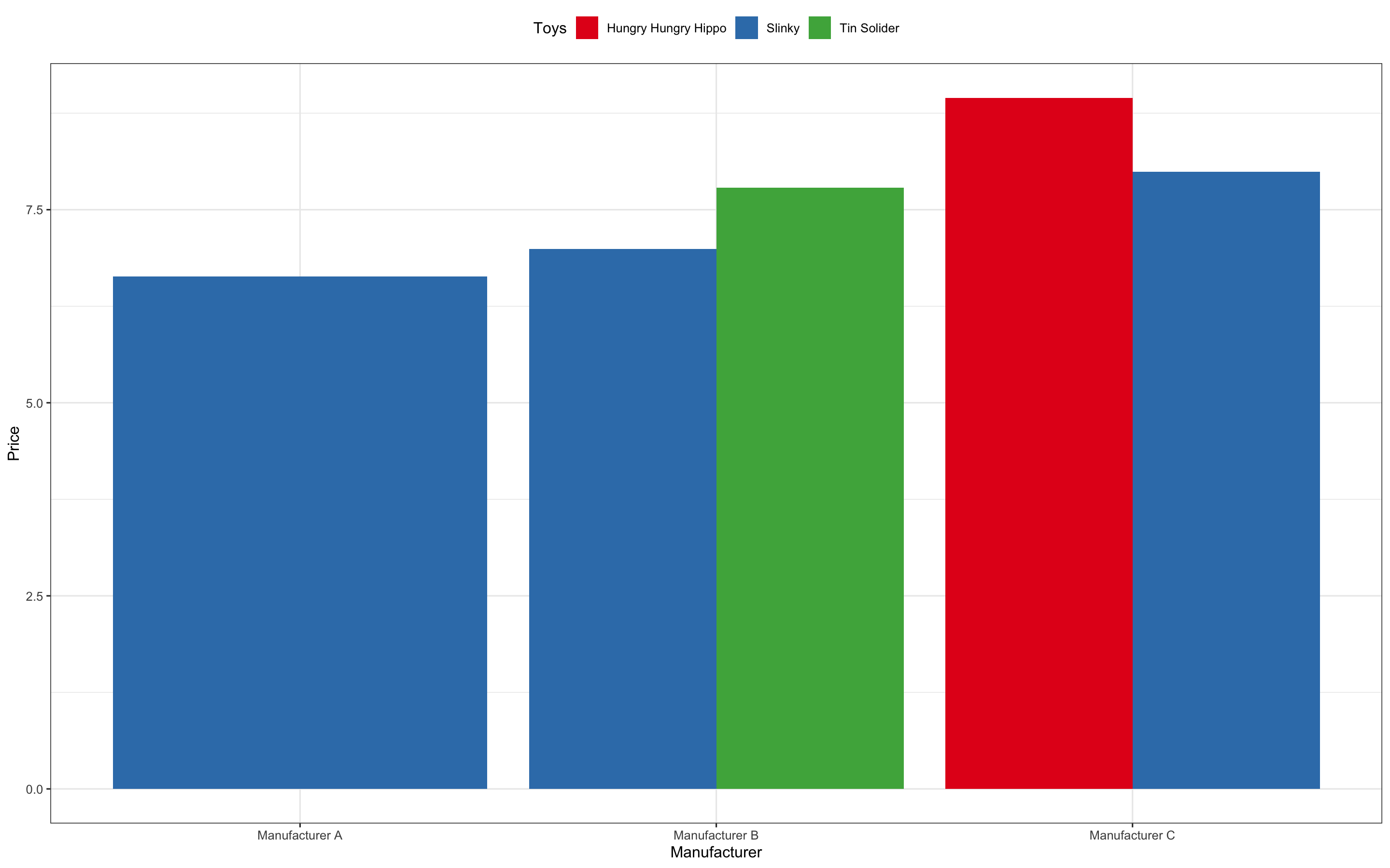
I was hoping to pick people's brain on better way visualize data that appears like this:
- Two categorical variables
- One continuous variable
I'm trying to visualize this data in way that is more appropriate than heat map. Does anyone have any suggestions?
Here's the code plus data (Note: There are more rows than the example data I have provided.):
test_data <- structure(list(Toys = c("Slinky", "Slinky", "Slinky", "Slinky",
                                     "Slinky", "Slinky", "Tin Solider", "Tin Solider", "Tin Solider",
                                     "Tin Solider", "Tin Solider", "Tin Solider", "Hungry Hungry Hippo",
                                     "Hungry Hungry Hippo", "Hungry Hungry Hippo", "Hungry Hungry Hippo",
                                     "Hungry Hungry Hippo", "Hungry Hungry Hippo"),
                            Manufacturer = c("Manufacturer A", "Manufacturer B", "Manufacturer C", "Manufacturer A", "Manufacturer A",
                                             "Manufacturer A", "Manufacturer B", "Manufacturer B", "Manufacturer B",
                                             "Manufacturer B", "Manufacturer B", "Manufacturer B", "Manufacturer C",
                                             "Manufacturer C", "Manufacturer C", "Manufacturer C", "Manufacturer C",
                                             "Manufacturer C"),
                            Price = c(5.99, 6.99, 7.99, 9, 6, 5.54, 7,
                                      9.99, 6.99, 6.75, 8, 7.99, 9.99, 7.99, 5.99, 8.99, 10.99, 9.75)),
                           class = "data.frame", row.names = c(NA, -18L))

melted_test_data <- reshape::melt(test_data %>% select(Toys,Manufacturer, Price))

library(plotly)
library(scales)
plot_test_data <- melted_test_data %>%
  ggplot(aes(x = Manufacturer, y = Toys, fill = value)) +
  geom_tile() +
  scale_fill_distiller(palette = 'Accent', label =  label_comma()) +
  theme(panel.background = element_rect(fill = 'white'), axis.text.x = element_text(angle = 45, hjust = 1), plot.title = element_text(hjust = 0.5)) +
  labs(title ="Price by Manufacturer and Toys", x = "Manufacturers", y = "Manufacturer") +
  guides(fill = guide_colourbar(title = "price($)"))
ggplotly(plot_test_data)

