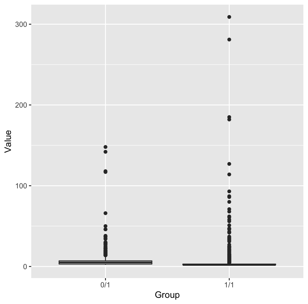
I want to show points across two groups. However, for both groups, there are some points which are far away from most of the other points within each group, shown below. Any suggestions for this situation? Thank you.
-
$\begingroup$ How about a boxplot? statmethods.net/graphs/boxplot.html $\endgroup$– PeterCommented Jun 29, 2020 at 9:29
-
1$\begingroup$ I think these are actually boxplots, but it's hard to see because of the extreme outliers $\endgroup$– David MasipCommented Jun 29, 2020 at 9:53
-
$\begingroup$ Use a log scale for values ? $\endgroup$– Lucas MorinCommented Jun 29, 2020 at 13:07
-
1$\begingroup$ @lcrmorin Thanks. Use log-scale y-axis is a good choice for now. $\endgroup$– JieCommented Jun 29, 2020 at 13:29
2 Answers
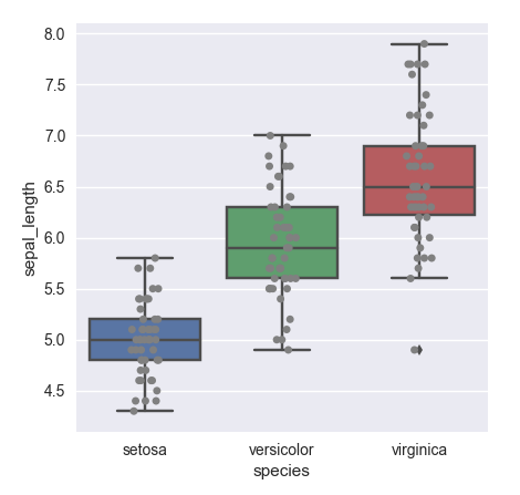
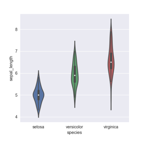
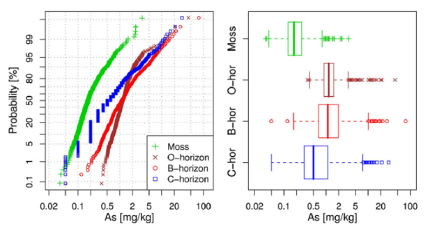
If you want to see the distribution of the data that is hidden in the bottom portion, you can add a histogram or probability plot, or even a violin plot. Each will show the distribution of the data more clearly than this boxplot does, and you can still see the true value directly. You can also add some jitter to the boxplot to see more of the overlapping points displayed.
-
$\begingroup$ Thank you. I'm a little confused. What do you mean by adding a histogram? An extra figure? I don't think a histogram is a good choice since the data spread widely and unevenly. Personally I do not think the violin plot is a good idea since the density plot (density estimation) will extend to some negative area that doesn't' match with the real case. Maybe the last suggestion (Probability Plot with Boxplot) is a good idea. The drawback here is that lots of information are lost when the number of points is quite different among groups since the y-axis is a proportion. $\endgroup$– JieCommented Jun 30, 2020 at 3:02
If the values are greater than 0, you can apply the logarithm to Value and you should be able to compare the distributions much more. Another thing you can do is cropping at some value (let's say Value = 10) but you are going to lose some information.
If your values are not greater than 0 but have a lower bound (let's say -t), you can apply the transform log(x + t), and the logarithm won't explode.
-
$\begingroup$ Thanks. Use log-scale y-axis is a good choice for now $\endgroup$– JieCommented Jun 29, 2020 at 13:29
-
1$\begingroup$ I mean log-scale y axis is a better choice here which is different from log(value). For the latter condition, we can not see the real value directly I think. $\endgroup$– JieCommented Jun 29, 2020 at 13:56


