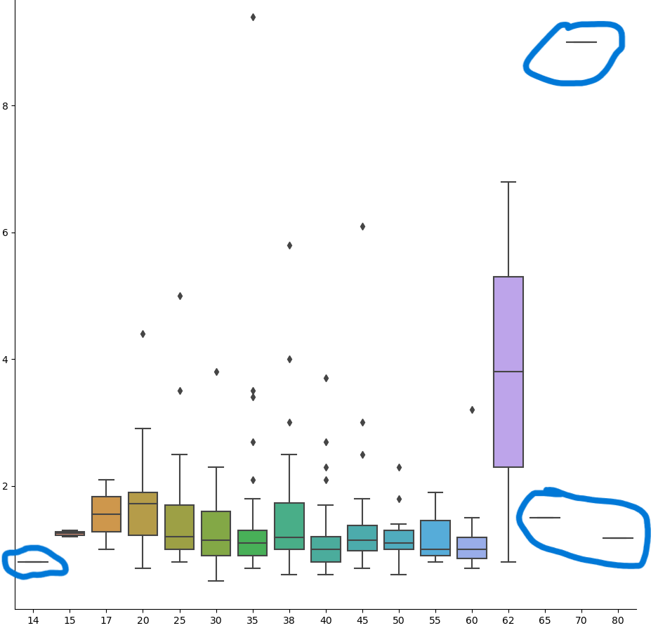
I am learning python and I am practicing with a project using a dataset. I created a box plot using seaborn's catplot only using the arguments data,x,y,and kind. There is something on the box plot (circled) that I am unfamiliar with and I'm not sure how to interpret this. Do these lines mean that the data for that specific number on the x-axis is just really small? Zooming in did not make those bigger, so I'm assuming those lines means there is just one data point.
-
$\begingroup$ It can either be that: 1) the data is constant, or 2) that the values are very close to the mean (i.e. their interval is very small.) Can you check min/max values for those features? $\endgroup$– Luca AnzaloneCommented Aug 10, 2023 at 16:36
2 Answers
For certain x values (14, 65, 70, 80), all the y values are the same. For these x values, the boxplot of the y values collapses to a single horizontal line.
Because the x values are not equally spaced, you might consider a scatterplot to better represent the distribution of the x variable. You can overlay the plot with a loess curve or similar to display the relationship between y and x.
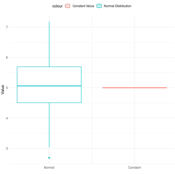
It can be a constant value, as stated by @LucaAnzalone.
Take this code as example:
library(ggplot2)

# creating a dataframe with a normally distributed column
# and a column with constant values

set.seed(123)  # It is just to make this results the same if you try in you pc.
n <- 100
df <- data.frame(
  normal_value = rnorm(n, mean = 5, sd = 1),  # Normally distributed column
  constant_value = rep(5, n)  # Constant value column
)

p <- ggplot(df) +
  geom_boxplot(aes(x = 1, y = normal_value, color = "Normal Distribution")) +
  geom_boxplot(aes(x = 2, y = constant_value, color = "Constant Value")) +
  # the following lines are just for decoration purposes
  labs(x = "", y = "Value") +
  scale_x_continuous(breaks = c(1, 2), labels = c("Normal", "Constant")) +
  theme_minimal() +
  theme(legend.position = "top")

p
Hope this helps.


