I'm using the Kaggle Titanic dataset. One feature is "Embarked", the city the passenger embarked from. The survival rate appears to correlate with it, but I'm worried it may just be correlated with the ticket Fare (which the survival rate definitely correlates with).
I want to plot a histogram of the fares. That would be easy. However, I also want to, on the same plot, have the histograms for the three embarked values (Q,C,S), labeled by different colors.
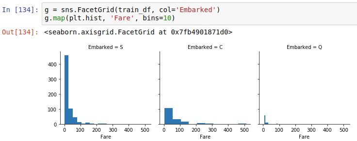
I've searched but can't figure out how. I can achieve something relatively similar with FacetGrid:
g = sns.FacetGrid(train_df, col='Embarked')
g.map(plt.hist, 'Fare', bins=20)
which gives three separate histograms, almost what I want:
But that's not quite what I want. For example, it's not great for comparing them. I could calculate the averages, but ideally I'd see them overlaid, so the three histograms are on the same plot, and you can tell them apart because they're labeled different colors.
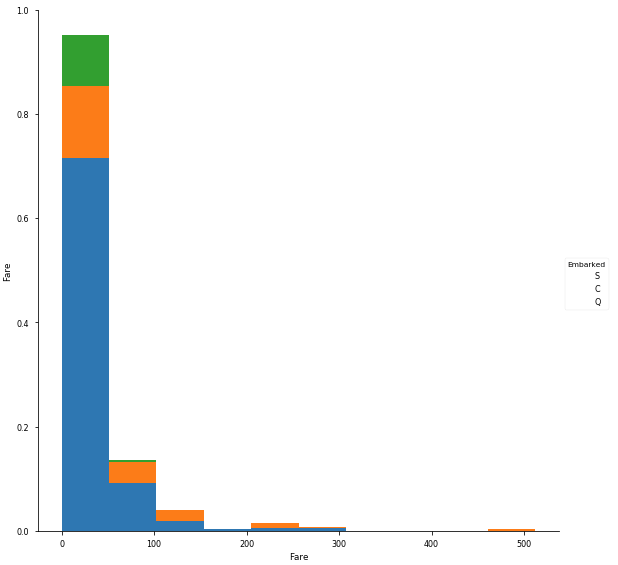
It seems like PairGrid is almost what I want, but it appears to be giving some strange axis for "Fare" (which is not between 0 and 1), and the legend is blank, and the colors are solid (so you can kind of only see the top layer).
g = sns.PairGrid(train_df[["Embarked","Fare"]], hue="Embarked",size=8)
g = g.map_diag(plt.hist)
g = g.add_legend()
I'm very confused and not sure how to even go about finding the right answer. It seems like Seaborn can do anything, some really cool things, but it's just impossible to find the specific thing I want to do for a given circumstance.
How could I achieve this?


