1
$\begingroup$

I am out of ideas in regards to plotting different sets of data ....

I have 10 sets of data ... Each set contains Actual Speed of vehicle and predicted Speed of Vehicle..

How can i combine all sets of data and show in a meaningful manner ? I don't think I can simply average as they are absolute values (In one run , i was going 25mph and second run , i might be going 30 mph)//...

Is there any idea on how i can represent 10 sets of data in a meaningful manner like variance ?

Any ideas are appreciated

$\endgroup$
3
  • $\begingroup$ Plot the difference between the two on a (log scale if too large) $\endgroup$
    – Aditya
    Commented Mar 26, 2018 at 5:56
  • 1
    $\begingroup$ Possible duplicate of How to plot similarity of two datasets? $\endgroup$
    – Aditya
    Commented Mar 26, 2018 at 5:56
  • $\begingroup$ The question about plotting similarity of two datasets was solved by a difference between simulation and expectation on the Y-axis and a logarithmic scale of x on the X-axis. Here you don't have a value in any of the ten datasets that could be used as X-axis if you were to use the difference between speed of vehicle and predicted speed of vehicle. In addition there are better alternatives to plotting this particular problem than a scatterplot. $\endgroup$
    – wacax
    Commented Mar 26, 2018 at 17:06

1 Answer 1

1
$\begingroup$

There are two solutions to this problem, though I'm only going explain the second one because I think is the best option.

First option:

10 Scatterplots of speed of vehicle on the x-axis and predicted speed of vehicle on the y-axis. The only scenario I see this plot been useful is for clustering different types of vehicles with their speeds (if there actually are many vehicle models). Naturally you could also aggregate all data points in a single scatterplot and color-code the data set (ex. dataset1 = blue, dataset 2 = red, etc.)

Second option:

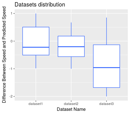
Calculate the difference of vehicle speed and predicted speed for each data point and then bind all the results into a single data table so that each column contains the difference between actual speed and predicted speed for each data set. Then plot each column as a bar in a boxplot, here you will be able to describe all differences including signs for outliers and mean. As you might already know boxes represent standard deviation (variance) and the central line represents the mean. You can find more information about boxplots here: Wikipedia

Sample code in R and ggplot2

dt1 <- data.frame(data = c(runif(20, min = -1, max = 1),
                       runif(20, min = -1, max = 1), 
                       runif(20, min = -2, max = 1)), 
              datasetName = c(rep("dataset1", 20),
                              rep("dataset2", 20), 
                              rep("dataset3", 20)))


ggplot(dt1, aes(x = datasetName, y = data)) +
geom_boxplot(fill = "white", colour = "#3366FF") +
labs(x = "Dataset Name", y = "Difference Between Speed and Predicted Speed",  title = "Datasets distribution")

The resulting image should look something like this: Sample Image
$\endgroup$

Your Answer

By clicking “Post Your Answer”, you agree to our terms of service and acknowledge you have read our privacy policy.

Not the answer you're looking for? Browse other questions tagged or ask your own question.