1
$\begingroup$

I've a simple dataset:

  • Id
  • Longitude
  • Latitude
  • Value

What can I obtain at the moment are "one map point" in every place.. Sum of Value don't affect "density" color. I would like to display a Geographic Heat Map like this (i copied from Google image). How ?

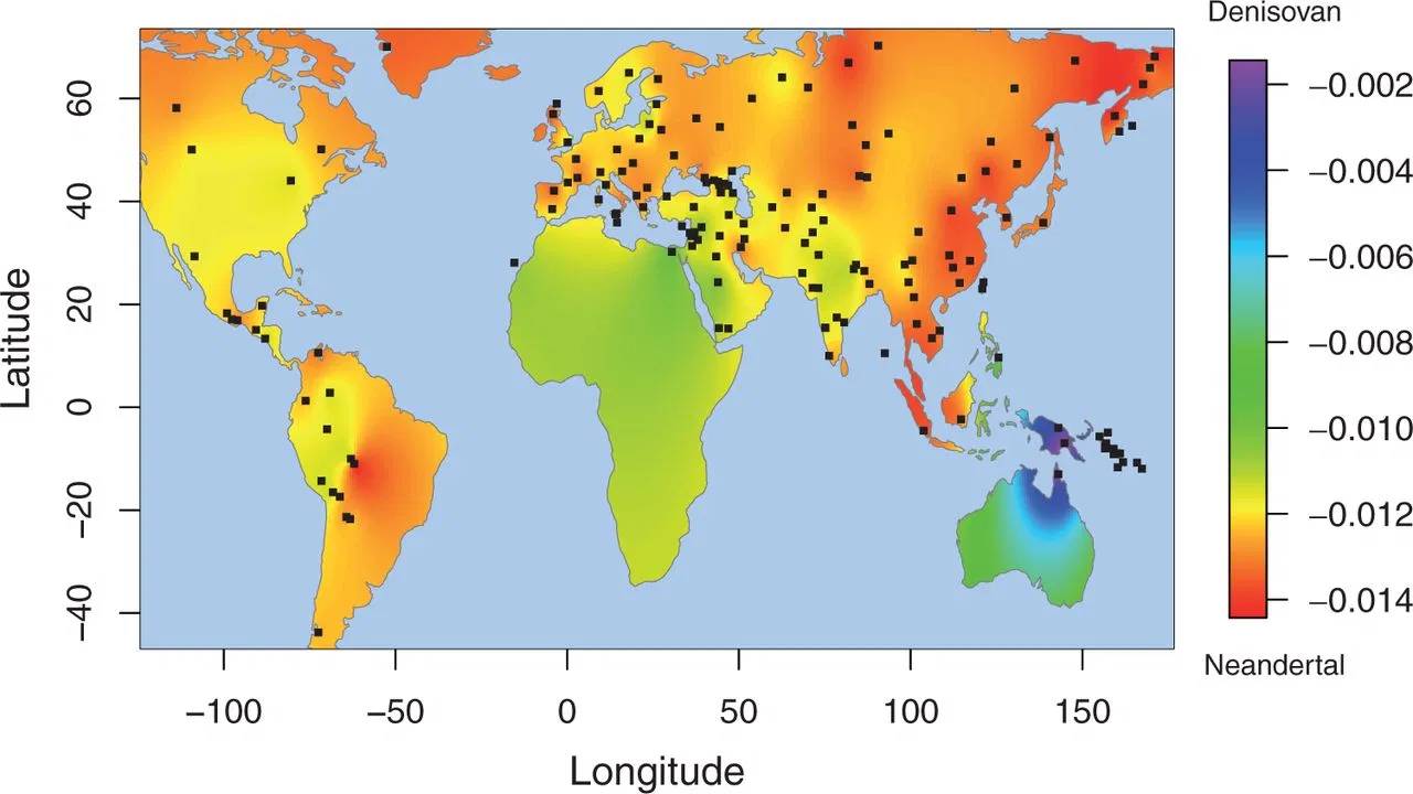
enter image description here

$\endgroup$

1 Answer 1

1
$\begingroup$

Set the latitude and put it under rows, select longitude and put it under cols. Select value and drop it to the center of the sheet. And under the marks dropdown select filled maps.

Make sure you see filled maps in the dropdown and that the value column is selected for color.

Edit: Do this for gradual color in heatmap- click on color tab. Select edit Color-now choose stepped color. This should do the work of filled maps with gradual colors.

Hope it was helpful.

$\endgroup$
2
  • $\begingroup$ This give me a point each record ... Not a "dark red" point if value is high, and "light red" if value is low ... this is not heat map .. This a density map based on row number, not values.. $\endgroup$
    – stighy
    Commented Nov 22, 2019 at 15:09
  • $\begingroup$ did you drag value to the color on the marks card and select maps or automatic in the drop down it should fill the areas based on the color palette you chose. $\endgroup$
    – cap
    Commented Nov 22, 2019 at 16:40

Your Answer

By clicking “Post Your Answer”, you agree to our terms of service and acknowledge you have read our privacy policy.

Not the answer you're looking for? Browse other questions tagged or ask your own question.