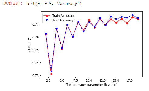
I'm new to data science/ml and working on using the sklearn libraries to classify data. I'm currently using the KNeighborsClassifier with 5 fold cross validation whilst tweaking the k value but its producing a graph that looks quite strange.
I have my training data and test data in 2 different CSV files and load them in like this:
trainData = pd.read_csv('train.csv',header='infer')
testData = pd.read_csv('test.csv',header='infer')
I then separate the classifiers (Y is name of the column in my dataset that's the classification):
trainY = trainData['Y']
trainX = trainData.drop(['Y'],axis=1)

testY = testData['Y']
testX = testData.drop(['Y'],axis=1)
I use sklearn KNeighborsClassifier with 5 fold cross validation whilst tweaking the k value from 2 to 20:
trainAcc = []
testAcc = []

for i in range(2,20):
    clf = KNeighborsClassifier(n_neighbors=i, metric='minkowski', p=2)
    trainScores = cross_val_score(estimator=clf, X=trainX, y=trainY, cv=5, n_jobs=4)
    testScores= cross_val_score(estimator=clf, X=testX, y=testY, cv=5, n_jobs=4)
    trainAcc.append((i, trainScores.mean()))
    testAcc.append((i, testScores.mean()))
I then print the graph:
plt.plot([x[0] for x in trainAcc],[x[1] for x in trainAcc], 'ro-', [x[0] for x in testAcc],[x[1] for x in testAcc], 'bv--')
But I get something weird like this:
Can anyone explain where I went wrong and why my graph looks the way it does.
Thanks.
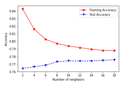
EDIT: It is indeed weird because when I run it without doing the cross-validation, I get a more normal graph like this:
clf.fit(X=trainX, y=trainY)
predTrainY = clf.predict(trainX)
predTestY = clf.predict(testX)
trainAcc.append(accuracy_score(trainY, predTrainY))
testAcc.append(accuracy_score(testY, predTestY))


clf.fit(X=trainX, y=trainY)predTrainY = clf.predict(trainX)predTestY = clf.predict(testX)I get much more of a normal graph, so I'm not sure if I've applied the cross-validation correctly. Please see my edit. $\endgroup$cross_val_scoreincorrectly. That function splits into folds, trains the model and predicts for each train/test split. Running it on your (trainX, trainY) gives the test-fold average score, and running it on your (testX, testY) again gives a test-fold average, with models trained on subsets of testX now. Seeing the two scores track closely is expected! Do you still see the parity effect on the lower plot, if you include odd indices? $\endgroup$trainAcc.append((i, accuracy_score(trainY, predTrainY)))testAcc.append((i, testscores.mean()))$\endgroup$