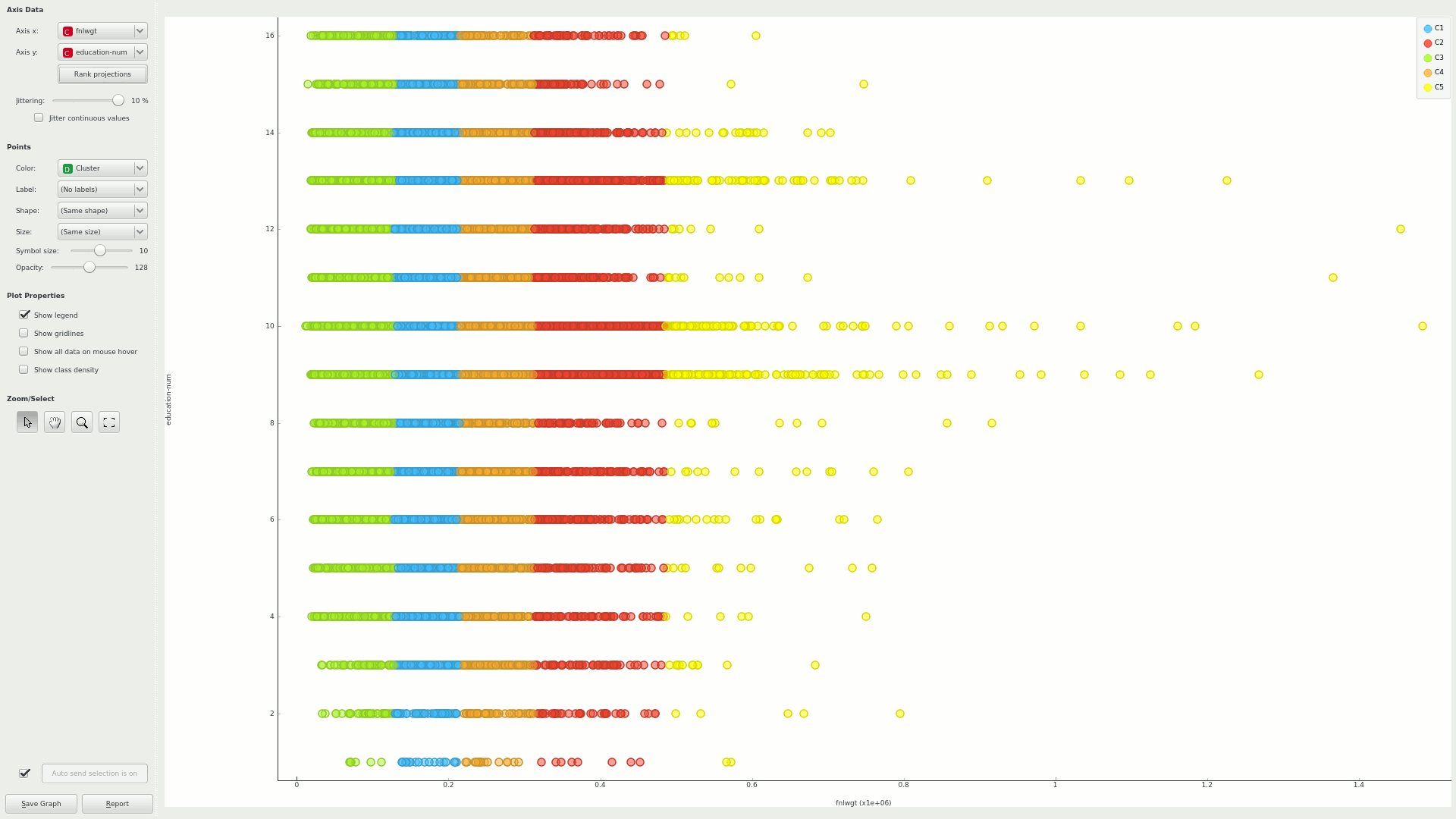
I have a sample dataset containing around 77k of rows and I have clustered them by using k mean clustering and colored the clusters using color manager. Now i would like to view them, However I could not set the No. of rows to display as 77k in Scatter Plot and Is there any way to visualize the clusters in Knime?
$\begingroup$
$\endgroup$
1
-
$\begingroup$ Did you had a look at the examples that comes with Knime, more specifically EXAMPLES > 04 Analytics > 03 Clustering > 01 Performing_a k-Means_Clustering ? Is that what you are looking for? BTW Knime is very limited when it comes to charting. $\endgroup$– tagomaCommented Dec 17, 2017 at 21:33
Add a comment
|
1 Answer
$\begingroup$
$\endgroup$
1
Can't help if you're fixed on KNIME, but if you can use Orange Data Mining, I've had success clustering (took a minute or so) and previewing a scatter plot of a dataset with 32k rows.
-
$\begingroup$ Thanks for sharing your idea. I was able to accomplish my task by using Row Sampling and I sampled the entire 77k into 10k data and was able to plot it. I am testing my data with several BI tools and will next try Orange Data mining. $\endgroup$– DannyCommented Jan 27, 2016 at 15:32

