2
$\begingroup$

I have applied the kMeans Clustering algorithm to a dataframe and have gained cluster labels for each row. I had selected only two features.
There are 4 clusters.
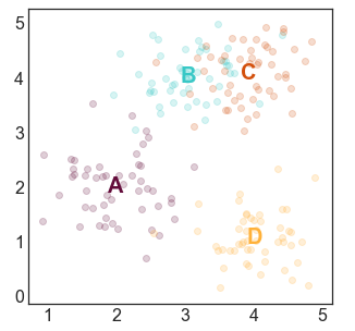
I want to visualize the datapoints in 2D plane with color-coded clusters which I want to look like this-
1

Ignore the labels. I would like to plot cluster centers instead.
I have looked in many blog posts, articles etc. None was helpful.
What is the most straightforward to achieve this?

$\endgroup$

1 Answer 1

1
$\begingroup$

There can be multiple ways, one can be -
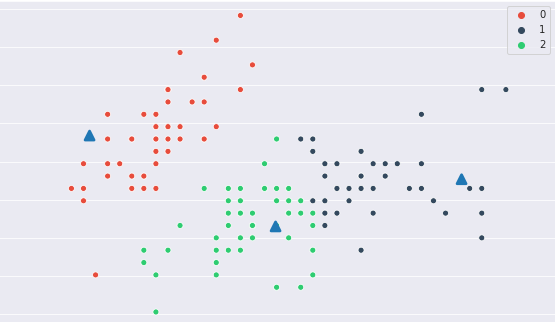
- Plot the points with hue=cluster_number
- Plot the Centroid with a different markers

Code for 3 Clusters on 2 Iris Features -

from sklearn import datasets
iris = datasets.load_iris()
X = iris.data  
y = iris.target
X=X[:,:-2]
X = (X - X.mean())/X.std()

def create_cluster(k=3):
    from sklearn.cluster import KMeans
    kmeans = KMeans(n_clusters=k)

    kmeans.fit(X)
    return kmeans

kmeans = create_cluster()
y_pred = kmeans.predict(X)
centroid = kmeans.cluster_centers_

_, ax = plt.subplots(1,1,figsize=(10,6))
color = ["#e74c3c", "#34495e", "#2ecc71"]
sns.scatterplot(X[:,0],X[:,1], hue=y_pred, palette=sns.color_palette(color),ax=ax)
sns.pointplot(centroid[:,0], centroid[:,1],markers='^',join=False,ax=ax)

$\hspace{2cm}$Output - Ignore the convergence quality

$\hspace{2cm}$ enter image description here

$\endgroup$

Your Answer

By clicking “Post Your Answer”, you agree to our terms of service and acknowledge you have read our privacy policy.

Not the answer you're looking for? Browse other questions tagged or ask your own question.