1
$\begingroup$

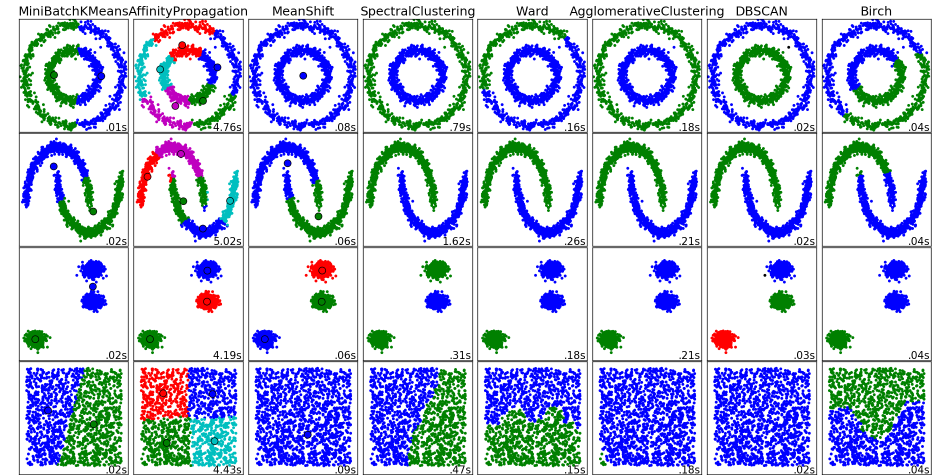
I have a set of points where I performed a KMeans classification. How make a plot where the color of the point is based on the cluster they belong?

EDIT: for clarification, having the set of points, I want to use the values of the array generated from KMeans.predict() ( from sklearn) to choose the color of each point.

$\endgroup$
1
  • 1
    $\begingroup$ This might also help you if you want to plot in matplotlib. Else, @Emre's answer should be good to go :) $\endgroup$
    – Dawny33
    Commented Feb 19, 2016 at 16:39

1 Answer 1

1
$\begingroup$

The sklearn documentation shows you how:

colors = np.array([x for x in 'bgrcmykbgrcmykbgrcmykbgrcmyk'])
colors = np.hstack([colors] * 20)
...
if hasattr(algorithm, 'cluster_centers_'):
        centers = algorithm.cluster_centers_
        center_colors = colors[:len(centers)]
        plt.scatter(centers[:, 0], centers[:, 1], s=100, c=center_colors)

enter image description here

$\endgroup$
1

Your Answer

By clicking “Post Your Answer”, you agree to our terms of service and acknowledge you have read our privacy policy.

Not the answer you're looking for? Browse other questions tagged or ask your own question.