0
$\begingroup$

I have this dataset (just a sample):

product1,product2,product3
product1,product4
product1,product2
product4,product3,product1,product2

The products are grouped by transaction. I want to create some data visualization using this dataset but I don't any tool or any type of visualization that allows creating some visualization with this structure...

Anyone can suggest me an option?

Thanks!

I feel desperate because they can not find anything that suits this data structure

$\endgroup$
7
  • 1
    $\begingroup$ But what do you want this visualisation for? What are you trying to find out? A visualisation is an answer to a question, and you haven't told us the question. $\endgroup$
    – Spacedman
    Commented Oct 11, 2016 at 19:49
  • $\begingroup$ @Spacedman I want to find the strenght like a heat-map or a grid chart...A visualization that allows me to conclude what the most frequently item purchase together...but with this strucuture I can't find any tool $\endgroup$
    – SaCvP
    Commented Oct 11, 2016 at 21:49
  • $\begingroup$ a similar question was asked recently here, this would work for a not too large number of items $\endgroup$
    – oW_
    Commented Oct 11, 2016 at 23:20
  • $\begingroup$ How can a visualisation be any better than a sorted table of pair-wise occurrences? $\endgroup$
    – Spacedman
    Commented Oct 12, 2016 at 7:13
  • $\begingroup$ @Spacedman Which type of tool/language did you recommend to produce that table? $\endgroup$
    – SaCvP
    Commented Oct 12, 2016 at 8:12

2 Answers 2

1
$\begingroup$

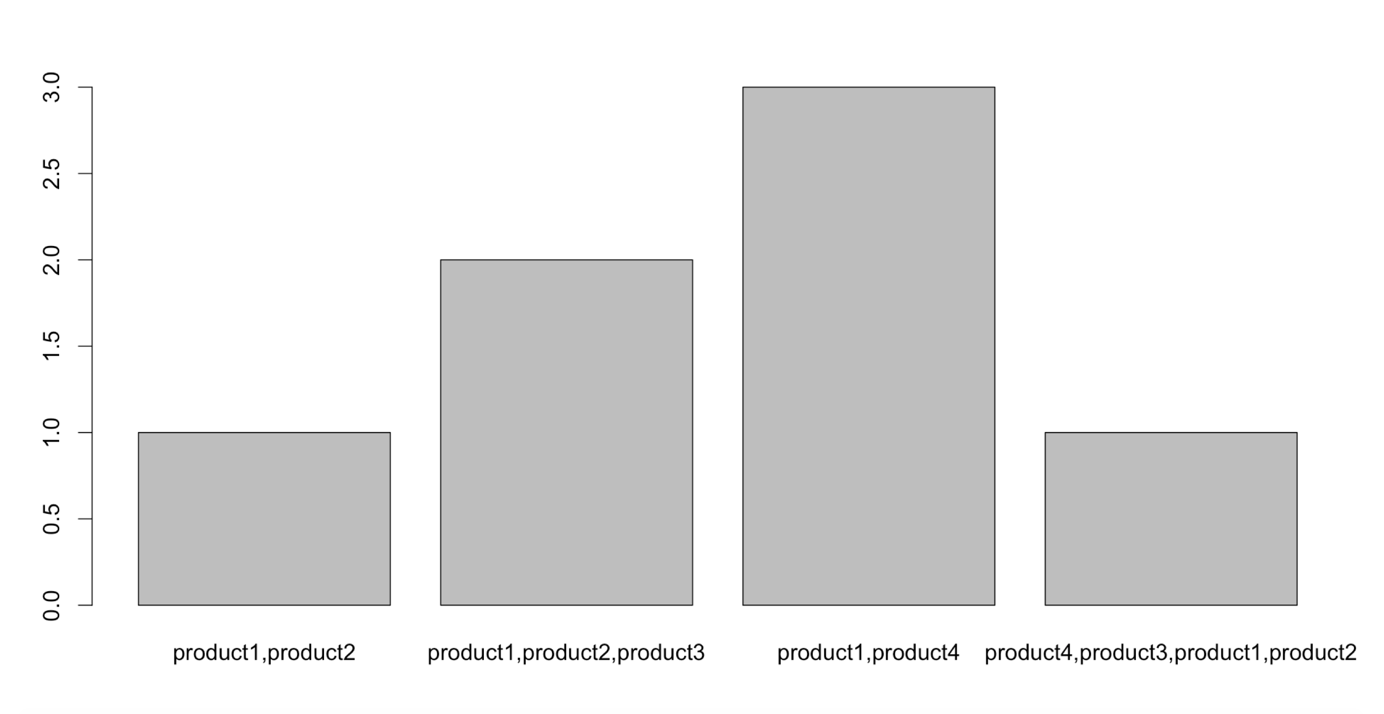
Considering data stored in CSV format like below without headers you can use below R code to plot simple bar chart. It will plot occurrences of transactions grouped by unique transactions.

product1,product2,product3
product1,product4
product1,product2
product4,product3,product1,product2
product1,product2,product3
product1,product4
product1,product4

R Code -

transactions <- read.csv("filepath/transactions.csv", header = FALSE)
transactions$V1
plot(transactions$V1)

Bar Chart-

enter image description here

$\endgroup$
0
$\begingroup$

You can use plotly for making interactive visualization and charts. You can also give a try to Linkurious. Hope it helps. Cheers! :)

$\endgroup$

Your Answer

By clicking “Post Your Answer”, you agree to our terms of service and acknowledge you have read our privacy policy.

Not the answer you're looking for? Browse other questions tagged or ask your own question.