10
$\begingroup$

I have a dataset in following structure inserted in a CSV file:

Banana  Water   Rice
Rice    Water
Bread   Banana  Juice

Each row indicates a collection of items that were purchased together. For example, the first row denotes that the items Banana, Water, and Rice were purchased together.

I want to create a visualization like the following:

example visualization

This is basically a grid chart but I need some tool (maybe Python or R) that can read the input structure and produce a chart like the above as output.

$\endgroup$

5 Answers 5

6
$\begingroup$

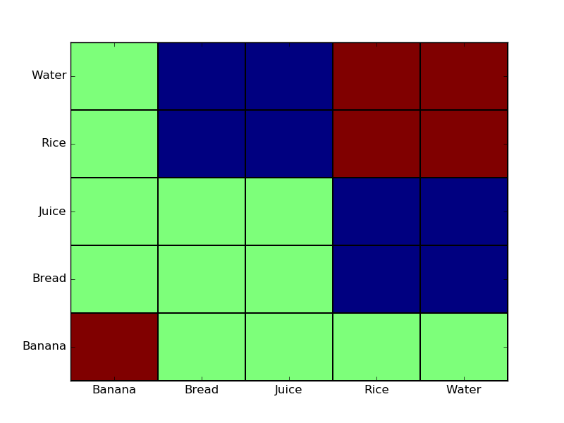
I think what you probably want is a discrete version of a heat map. For example, see below. The red colors indicate the most commonly purchased together, while green cells are never purchased together. heat map

This is actually fairly easy to put together with Pandas DataFrames and matplotlib.

import numpy as np
from pandas import DataFrame
import matplotlib
matplotlib.use('agg') # Write figure to disk instead of displaying (for Windows Subsystem for Linux)
import matplotlib.pyplot as plt

####
# Get data into a data frame
####
data = [
  ['Banana', 'Water', 'Rice'],
  ['Rice', 'Water'],
  ['Bread', 'Banana', 'Juice'],
]

# Convert the input into a 2D dictionary
freqMap = {}
for line in data:
  for item in line:
    if not item in freqMap:
      freqMap[item] = {}

    for other_item in line:
      if not other_item in freqMap:
        freqMap[other_item] = {}

      freqMap[item][other_item] = freqMap[item].get(other_item, 0) + 1
      freqMap[other_item][item] = freqMap[other_item].get(item, 0) + 1

df = DataFrame(freqMap).T.fillna(0)
print (df)

#####
# Create the plot
#####
plt.pcolormesh(df, edgecolors='black')
plt.yticks(np.arange(0.5, len(df.index), 1), df.index)
plt.xticks(np.arange(0.5, len(df.columns), 1), df.columns)
plt.savefig('plot.png')
$\endgroup$
7
  • $\begingroup$ Many thanks :) Can I create this using Spark Mllib? $\endgroup$ Commented Oct 7, 2016 at 8:22
  • $\begingroup$ @João_testeSW You probably can, but I'm unfamiliar with Spark. $\endgroup$
    – apnorton
    Commented Oct 7, 2016 at 15:08
  • $\begingroup$ did you recommend any IDE for executing this code? $\endgroup$ Commented Oct 7, 2016 at 15:44
  • $\begingroup$ @João_testeSW If you save this in a file as "somescript.py", you can run it with "python3 somescript.py" on the terminal. No IDE needed, but if you load it into some Python-capable IDE it should run. $\endgroup$
    – apnorton
    Commented Oct 7, 2016 at 15:47
  • $\begingroup$ thanks ;) I'll see if I can use it into Pyspark, if yes then I can edit the post with the solution ;) $\endgroup$ Commented Oct 7, 2016 at 15:58
3
$\begingroup$

For R, you can use library ArulesViz. There is nice documentation and on the page 12, there is example how to create this kind of visualization.

The code for that is as simple as this:

plot(rules, method="grouped")
$\endgroup$
1
  • $\begingroup$ While it's not what the OP is looking for, there's a great example visualization using this library here: algobeans.com/2016/04/01/… $\endgroup$
    – user35581
    Commented Mar 22, 2018 at 17:40
0
$\begingroup$

With Wolfram Language in Mathematica.

data = {{"Banana", "Water", "Rice"},
        {"Rice", "Water"},
        {"Bread", "Banana", "Juice"}};

Get pairwise counts.

counts = Sort /@ Flatten[Subsets[#, {2}] & /@ data, 1] // Tally
{{{"Banana", "Water"}, 1}, {{"Banana", "Rice"}, 1}, 
 {{"Rice", "Water"}, 2}, {{"Banana", "Bread"}, 1}, 
 {{"Bread", "Juice"}, 1}, {{"Banana", "Juice"}, 1}}

Get indices for named ticks.

indices = Thread[# -> Range[Length@#]] &@Sort@DeleteDuplicates@Flatten[data]
{"Banana" -> 1, "Bread" -> 2, "Juice" -> 3, "Rice" -> 4, "Water" -> 5}

Plot with MatrixPlot using SparseArray. Could also use ArrayPlot.

MatrixPlot[
 SparseArray[Rule @@@ counts /. indices, ConstantArray[Length@indices, 2]],
 FrameTicks -> With[{t = {#2, #1} & @@@ indices}, {{t, None}, {t, None}}],
 PlotLegends -> Automatic
 ]

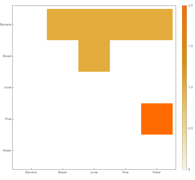
enter image description here

Note that it is upper-triangular.

Hope this helps.

$\endgroup$
0
$\begingroup$

You can do this in python with the seaborn visualization library (built on top of matplotlib).

data = [
  ['Banana', 'Water', 'Rice'],
  ['Rice', 'Water'],
  ['Bread', 'Banana', 'Juice'],
]

# Pull out combinations
from itertools import combinations
data_pairs = []
for d in data:
    data_pairs += [list(sorted(x)) + [1] for x in combinations(d, 2)]
    # Add reverse as well (this will mirror the heatmap)
    data_pairs += [list(sorted(x))[::-1] + [1] for x in combinations(d, 2)]

# Shape into dataframe
import pandas as pd
df = pd.DataFrame(data_pairs)
df_zeros = pd.DataFrame([list(x) + [0] for x in combinations(df[[0, 1]].values.flatten(), 2)])
df = pd.concat((df, df_zeros))
df = df.groupby([0, 1])[2].sum().reset_index().pivot(0, 1, 2).fillna(0)

import seaborn as sns
from matplotlib.pyplot import plt
sns.heatmap(df, cmap='YlGnBu')
plt.show()

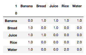
The final dataframe df looks like this:

enter image description here

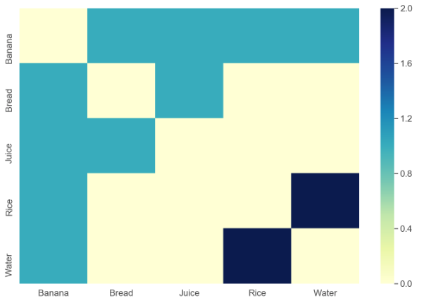
and the resulting visualization is:

enter image description here

$\endgroup$
0
$\begingroup$

You can use networkx to create a graph like structure.

Example : using python networkx package

import networkx as nx
import numpy as np
import matplotlib.pyplot as plt
G1 = nx.DiGraph()
color_map = []
N = 50
colors = np.random.rand(N)
strs = ['r0', 'r1']
for i in range(2):
    G1.add_nodes_from('r'+str(i))
    for a in top_rules.iloc[i]['antecedents']:
        G1.add_nodes_from([a])
        G1.add_edge(a, 'r'+str(i), color = colors[i], weight = 2)
    for c in top_rules.iloc[i]['consequents']:
        G1.add_nodes_from([c])
        G1.add_edge('r'+str(i), c, color = colors[i], weight = 2)
for node in G1:
    found_a_string = False
    for item in strs:
        if node == item:
            found_a_string = True
    if found_a_string:
        color_map.append('red')
    else:
        color_map.append('black')
edges = G1.edges()
print(edges)
colors = [G1[u][v]['color'] for u,v in edges]
weights = [G1[u][v]['weight'] for u,v in edges]
pos = nx.spring_layout(G1, k = 16, scale = 1)
fig = plt.figure(figsize = (4,4))
nx.draw(G1, pos, edges, node_color = color_map, edge_color = colors, width = weights, font_size = 16, with_labels = False)
for p in pos:
    pos[p][1] += 0.07
nx.draw_networkx_labels(G1, pos)
$\endgroup$

Your Answer

By clicking “Post Your Answer”, you agree to our terms of service and acknowledge you have read our privacy policy.

Not the answer you're looking for? Browse other questions tagged or ask your own question.