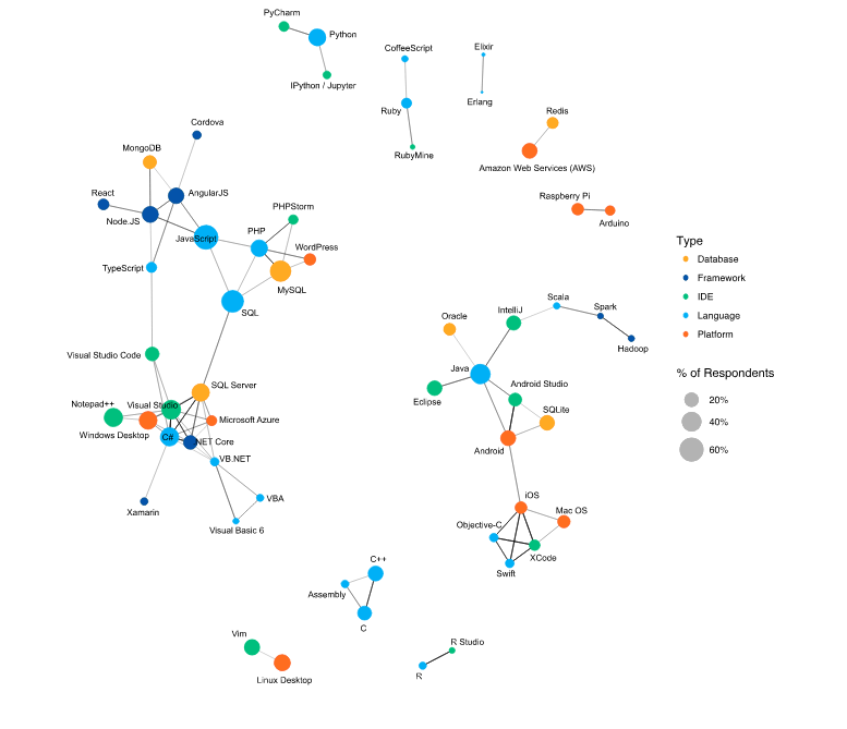
I recently saw the graph of correlated technologies from the SO Developer Survey, which was pretty; reproduced below:
I have a weighted graph that represents the amount of communication between pairs of people. I'd like to create a similar visualization as above. I want to be able to tease out "islands" of people with high influence among each other, but little influence elsewhere.
To make this concrete, let's say I have four animals: dog, wolf, cat, lion. The canines talk a lot amongst themselves; the felines do too, but members of one group only rarely talk to members of the other group. So my influence graph (which is symmetric, hence the upper triangular matrix) looks like:
+------+-----+------+-----+------+
|      | Dog | Wolf | Cat | Lion |
+------+-----+------+-----+------+
| Dog  | ∞   | 100  | 1   | 1    |
| Wolf | -   | ∞    | 3   | 2    |
| Cat  | -   | -    | ∞   | 130  |
| Lion | -   | -    | -   | ∞    |
+------+-----+------+-----+------+
I know how to create graphs whose edges are visually represented by the weight between two nodes, but I am not sure how to account or calculate islands of influence. Are there general visualization techniques to apply to a data set like this, and also for figuring out islands of influence?
Thanks in advance!

