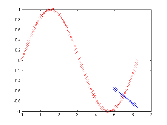
In the plot below the red crossed line is the actual curve and the crossed blue line is the predicted curve. I am using least squares for linear prediction. I have used 1:79 examples in training and the remaining for testing. The test data points are never seen during training. What is my mistake? Why am I getting such a weird prediction? I want to see the sine curve as the predicted output which should be very close to the original data.

%generate some data
x=linspace(0,2*pi,100)';
y=sin(x); %response

X=x;
y=y;
% Convert matrix values to double
X = double(X(1:79));
y = double(y(1:79));

% Plot data
plot(X, y, 'rx', 'MarkerSize', 10);

m = length(y);
% Add ones column
X = [ones(m, 1) X];

% Gradient Descent with Normal Equation
theta = (pinv(X'*X))*X'*y

% Predict  from 80 till last sample
test_samples = x(80:end);
test_samples_val = [ones(length(test_samples),1) test_samples];

% Calculate predicted value
pred_value = test_samples_val * theta;

X = vertcat(X, test_samples_val);
regressionline = X*theta;


% Plot predicted value with blue cross
plot(test_samples, pred_value, 'bx', 'MarkerSize', 10);
