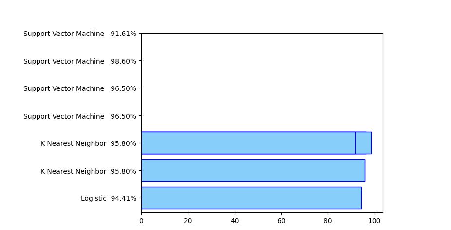
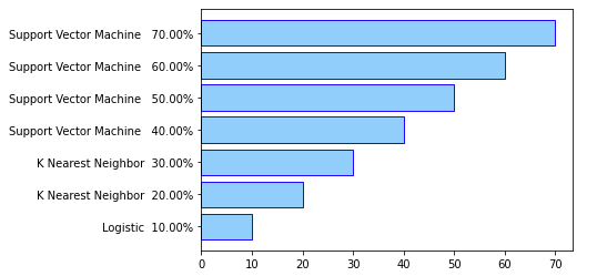
So for some weird reason I can't manage to fix the plotting issue
Any suggestions?
from sklearn.metrics import confusion_matrix

List = []
for i in range(len(model)):
  cm = confusion_matrix(Y_test, model[i].predict(X_test))

  TN = cm[0][0]
  TP = cm[1][1]
  FN = cm[1][0]
  FP = cm[0][1]

  List.append(((TP + TN) / (TP + TN + FN + FP))*100)

  print()

import numpy as np
import matplotlib.pyplot as plt

fig, ax = plt.subplots()
bars = ('Logistic', 'K Nearest Neighbor', 'K Nearest Neighbor', 'Support Vector Machine ', 'Support Vector Machine ','Support Vector Machine ','Support Vector Machine ' )
percentage = np.array([List[0], List[1], List[2], List[3],List[4],List[5],List[6]])


new_labels = [i+'  {:.2f}%'.format(j) for i, j in zip(bars, percentage)]

plt.barh(bars, percentage, color='lightskyblue', edgecolor='blue')
plt.yticks(range(len(bars)), new_labels)
# Show graphic
plt.show()


