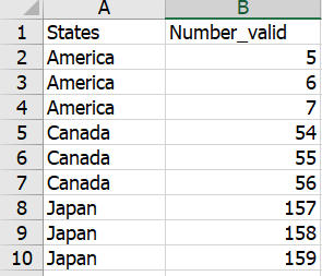
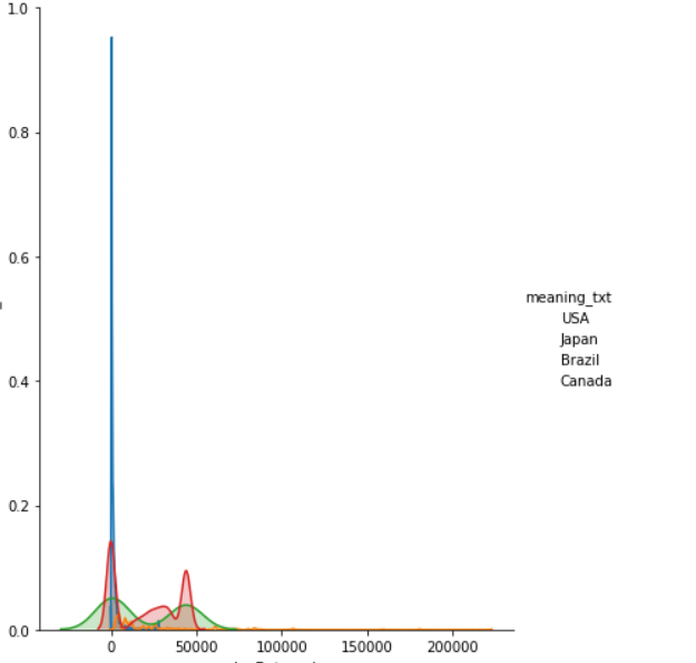
So, the question is asking about why the legend of the plot displayed here is not displaying any colours.
Without looking at the code you have used to generate the pair plot, I can see that, for example, the column name which inputted as the "hue" to the pair plot function should be used as the legend title. However, the title of this legend on the plot is not the same as the given column name. So, my first intuition leads to me to believe that you might have overwritten the legend attributes after this line sns.pairplot() line (maybe using plt.legend() after the pairplot line). Hence, maybe why the colours do not appear as well.


