2
$\begingroup$

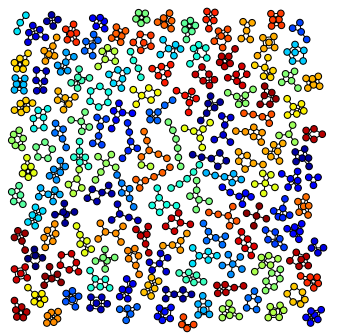
Suppose you have a big number of polynomials such as xyz+xy+z where xyz, xy and z are monomials. You wanna visualize the polynomials together something such as atlas below and show how they are related graphically.

enter image description here

The example is from here.

The edges could correspond to sum while the vertices could be monomials. It is also possible to do it so that each variable in monomial has their own vertex while two different kinds of edges are drawn: edges inside monomials and distinct edges to connect monomials of the same polynomial. Other visualizations are possible as well.

How can you visualize a big number of polynomials graphically?

P.s. Aspiring discussion in Mathematica SE.

$\endgroup$
3
  • $\begingroup$ If you are asking how to use the library you linked to, here is an example. $\endgroup$
    – Emre
    Commented Jan 25, 2016 at 22:42
  • $\begingroup$ @Emre Unless ready parser, each multiplication can be described as an edge and each summation as thinner edge. Same variables could have the same colouring. There are many ways to describe a group of polynomials, it is surprising if none has researched this visualisation issue earlier. Added simple example here about polynomials from Mathematica -- Networkx Sage may be the best option for basis polynomials and then graph infographics. $\endgroup$
    – hhh
    Commented Jan 25, 2016 at 23:17
  • $\begingroup$ On reflection I think this is a very interesting question but you should direct it to mathematicians, not data scientists: what quantities of interest do polyomials have? I suppose they will say it depends on what are you are trying to understand about it. Sure, we can help you draw this graph, but does it really afford any insight? $\endgroup$
    – Emre
    Commented Jan 27, 2016 at 8:50

0

Your Answer

By clicking “Post Your Answer”, you agree to our terms of service and acknowledge you have read our privacy policy.

Browse other questions tagged or ask your own question.