3
$\begingroup$

I am working with the titanic survivors data set.

I have the data as a DataFrame and I can create 1D visualizations such as histograms, and also see the correlations by calling data.corr().

I would like to create a scatter plot to represent the correlation between 'age' and 'survived'. I can't figure out how to plot this data because 'survived' is effectively an integer of 0 or 1 (died or lived, respectively)

If I do something like:

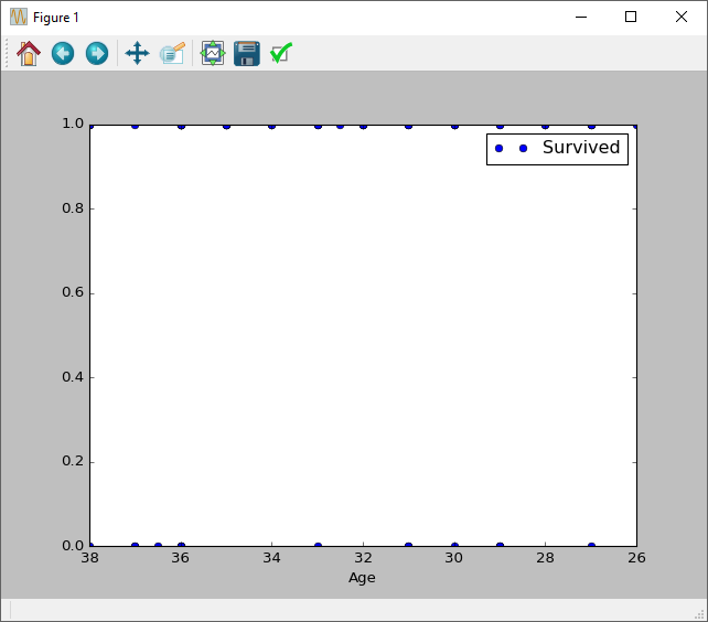
titanic_data.plot(x='Age', y='Survived', style='o')

I get a plot that looks like this: enter image description here
What I would like is a plot that somehow takes the average survival rate by age and created something more like this:

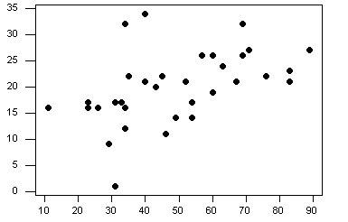
enter image description here

$\endgroup$

1 Answer 1

1
$\begingroup$

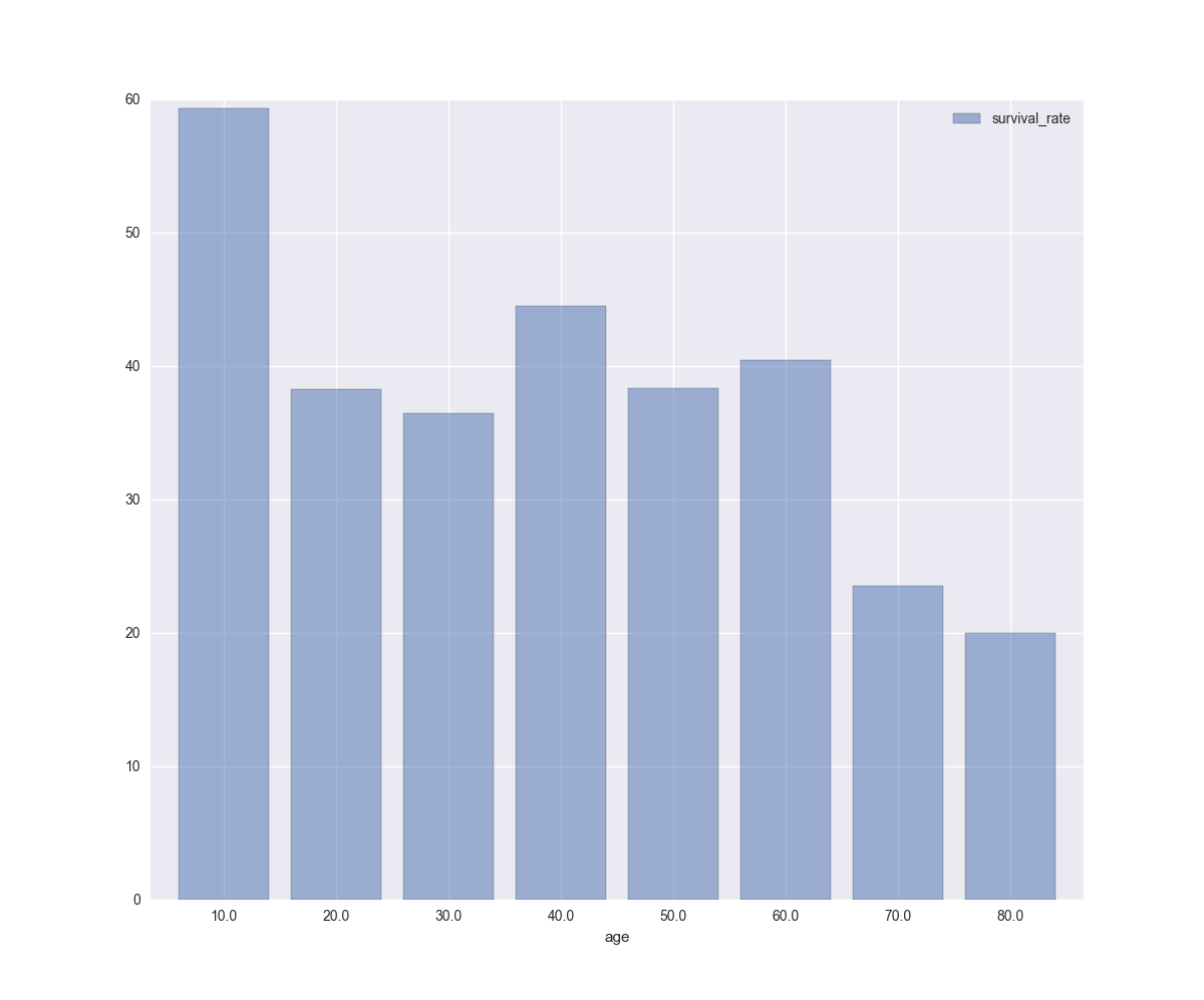
You can precalculate the survival rate (probability) and plot a bar plot:

import seaborn as sns

x = sns.load_dataset('titanic')

bins = np.linspace(0, 100, 11)
labels = bins[1:]

# let's group all ages by bins (10, 20, 30, ..., 100)    
rpt = (x.groupby(pd.cut(x.age, bins, labels=labels))
        .survived.mean()*100
      ).dropna().to_frame('survival_rate')


rpt.plot.bar(rot=0, width=0.8, alpha=0.5, figsize=(12, 10))

enter image description here

calculated data:

In [84]: bins
Out[84]: array([   0.,   10.,   20.,   30.,   40.,   50.,   60.,   70.,   80.,   90.,  100.])

In [85]: labels
Out[85]: array([  10.,   20.,   30.,   40.,   50.,   60.,   70.,   80.,   90.,  100.])

In [86]: rpt
Out[86]:
      survival_rate
age
10.0      59.375000
20.0      38.260870
30.0      36.521739
40.0      44.516129
50.0      38.372093
60.0      40.476190
70.0      23.529412
80.0      20.000000
$\endgroup$
0

Your Answer

By clicking “Post Your Answer”, you agree to our terms of service and acknowledge you have read our privacy policy.

Not the answer you're looking for? Browse other questions tagged or ask your own question.