0
$\begingroup$

When I plot my data to see its distribution via Swarmplot, these two vertical lines that seems to even overlap occur in the figure.
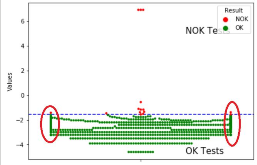
It seems to occur even around values that are not that dense, such as around -2.5. I feel like I might be missing how Swarmplot works but anyone knows the explanation?

$\endgroup$
1
  • $\begingroup$ Have you tried adjusting the figsize? $\endgroup$ Commented May 8, 2020 at 9:17

1 Answer 1

1
$\begingroup$

As per the Sea born documentation, -

https://seaborn.pydata.org/generated/seaborn.swarmplot.html

"This function is similar to stripplot(), but the points are adjusted (only along the categorical axis) so that they don’t overlap. This gives a better representation of the distribution of values,

but it does not scale well to large numbers of observations.

This style of plot is sometimes called a “beeswarm”."

A workaround may be adjusting the figsize.

$\endgroup$

Your Answer

By clicking “Post Your Answer”, you agree to our terms of service and acknowledge you have read our privacy policy.

Not the answer you're looking for? Browse other questions tagged or ask your own question.