11
$\begingroup$

I want to plot the bytes from a disk image in order to understand a pattern in them. This is mainly an academic task, since I'm almost sure this pattern was created by a disk testing program, but I'd like to reverse-engineer it anyway.

I already know that the pattern is aligned, with a periodicity of 256 characters.

I can envision two ways of visualizing this information: either a 16x16 plane viewed through time (3 dimensions), where each pixel's color is the ASCII code for the character, or a 256 pixel line for each period (2 dimensions).

This is a snapshot of the pattern (you can see more than one), seen through xxd (32x16):
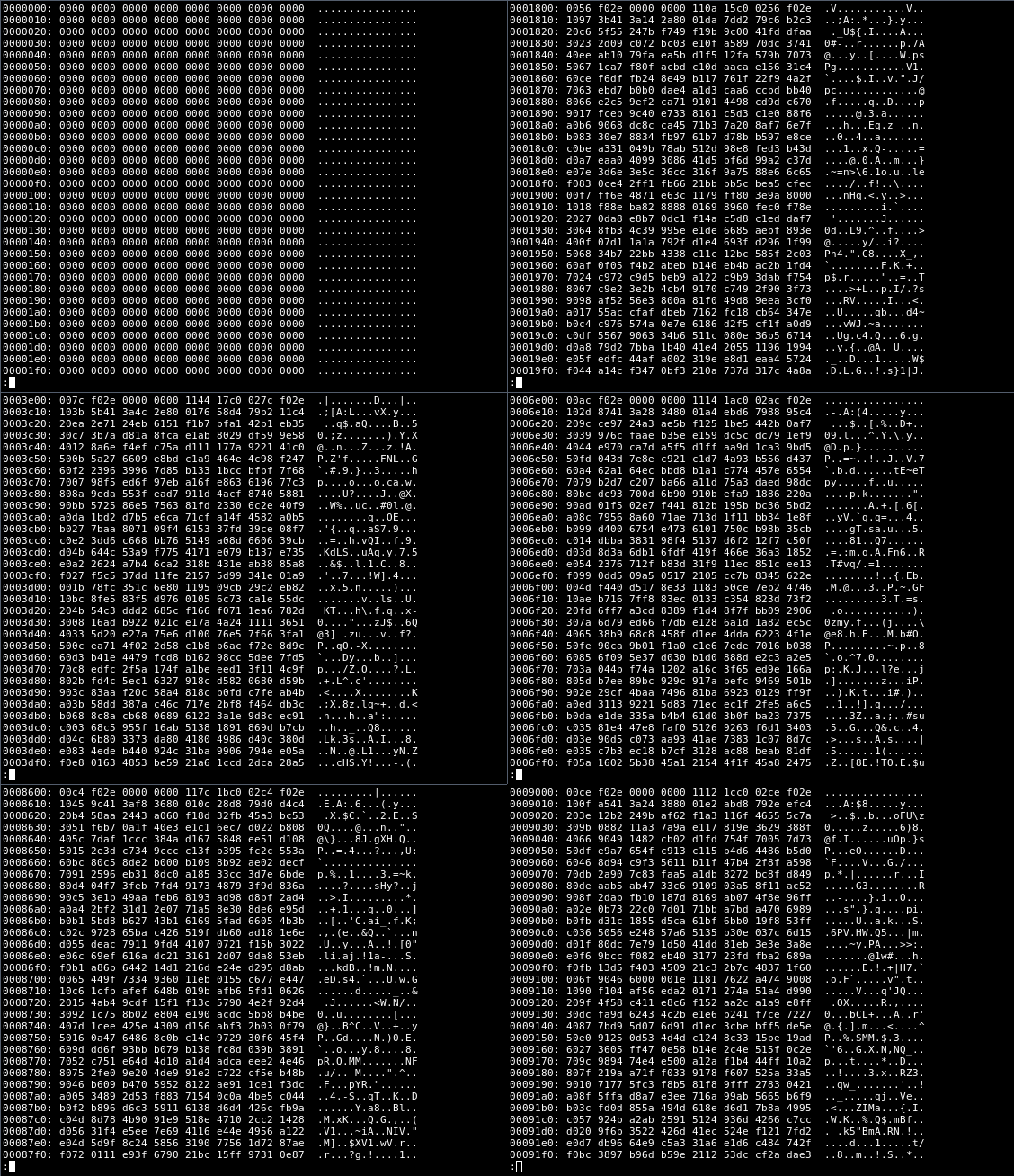
Pattern to analyze

Either way, I am trying to find a way of visualizing this information. This probably isn't hard for anyone into signal analysis, but I can't seem to find a way using open-source software.

I'd like to avoid Matlab or Mathematica and I'd prefer an answer in R, since I have been learning it recently, but nonetheless, any language is welcome.


Update, 2014-07-25: given Emre's answer below, this is what the pattern looks like, given the first 30MB of the pattern, aligned at 512 instead of 256 (this alignment looks better):
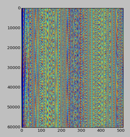
Graphical pattern

Any further ideas are welcome!

$\endgroup$
3
  • $\begingroup$ An example/excerpt of the data (maybe only a few MB) could be interesting. $\endgroup$
    – Marco13
    Commented Jul 25, 2014 at 9:43
  • $\begingroup$ If you're interested in the periodic nature of the data taking a look at the DFT of the data could be revealing. $\endgroup$
    – mrmcgreg
    Commented Jul 25, 2014 at 17:44
  • $\begingroup$ @mrmcgreg: I'll have to re-learn how the DFT works. I should've paid more attention to the signals & systems classes :) $\endgroup$ Commented Jul 26, 2014 at 3:10

3 Answers 3

5
$\begingroup$

I would use a visual analysis. Since you know there is a repetition every 256 bytes, create an image 256 pixels wide by however many deep, and encode the data using brightness. In (i)python it would look like this:

import os, numpy, matplotlib.pyplot as plt

%matplotlib inline

def read_in_chunks(infile, chunk_size=256):
    while True:
        chunk = infile.read(chunk_size)
        if chunk:
            yield chunk
        else:
            # The chunk was empty, which means we're at the end
            # of the file
            return

fname = 'enter something here'
srcfile = open(fname, 'rb')
height = 1 + os.path.getsize(fname)/256
data = numpy.zeros((height, 256), dtype=numpy.uint8)    

for i, line in enumerate(read_in_chunks(srcfile)):
    vals = list(map(int, line))
    data[i,:len(vals)] = vals

plt.imshow(data, aspect=1e-2);

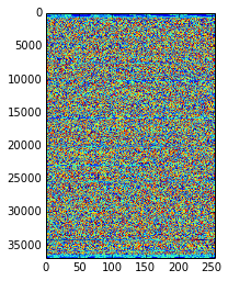
This is what a PDF looks like:

A PDF file visualized

A 256 byte periodic pattern would have manifested itself as vertical lines. Except for the header and tail it looks pretty noisy.

$\endgroup$
4
  • $\begingroup$ This looks quite like what I am looking for. I am studying for finals now and am unable to take time to think about this again, but as soon as I can I'll let you know. "A 256 byte periodic pattern would have manifested as vertical lines." -- exactly what I was thinking of. I can also show an image where I put all 256 bytes in the same line, and that is already obvious in text. I'm quite curious about what will come out of it :) $\endgroup$ Commented Jul 22, 2014 at 0:08
  • $\begingroup$ I can't seem to run this on Debian Linux. I installed the packages python-scitools and ipython. The error message is ValueError: invalid literal for int() with base 10: '#'. I'll see if I can make it work anyway... $\endgroup$ Commented Jul 25, 2014 at 2:41
  • $\begingroup$ I succeeded (by running the code directly inside ipython, and changing map(int, line) to map(ord, line), and updated the question with the new picture. $\endgroup$ Commented Jul 25, 2014 at 3:30
  • $\begingroup$ Took me an year, but I decided to accept this answer. I still don't know what that bitstream is, but I probably won't find out. It does have a nice pattern, though! $\endgroup$ Commented Jul 20, 2015 at 20:12
1
$\begingroup$

I know almost nothing about signal analysis, but 2-dimensional visualization could be easily done using R. Particularly you will need reshape2 and ggplot2 packages. Assuming your data is wide (e.g. [n X 256] size), first you need to transform it to long format using melt() function from reshape2 package. Then use geom_tile geometry from ggplot2. Here is a nice recipe with gist.

$\endgroup$
2
  • 2
    $\begingroup$ It's over 4 GB of data. I should plot it by reading from stdin or something similar. It's a bad idea to load everything to RAM. I'll take a look at what you said in a couple of days - and hopefully, any other ideas that may arise - and I'll let you know how it went, thanks! $\endgroup$ Commented Jul 20, 2014 at 1:39
  • $\begingroup$ Don't load it in and treat it like a dataframe, its not a dataframe, its a stream of bytes. $\endgroup$
    – Spacedman
    Commented Jul 25, 2014 at 12:56
1
$\begingroup$

I would look at the raster package for this, which can read in raw binary data and present it as NxM grids. It can even extract subsets of large binary grids without having to read in the whole file (the R raster object itself is just a proxy to the data, not the data itself).

$\endgroup$

Your Answer

By clicking “Post Your Answer”, you agree to our terms of service and acknowledge you have read our privacy policy.

Not the answer you're looking for? Browse other questions tagged or ask your own question.